Case study
Redesigning an emotion analysis platform
Intro
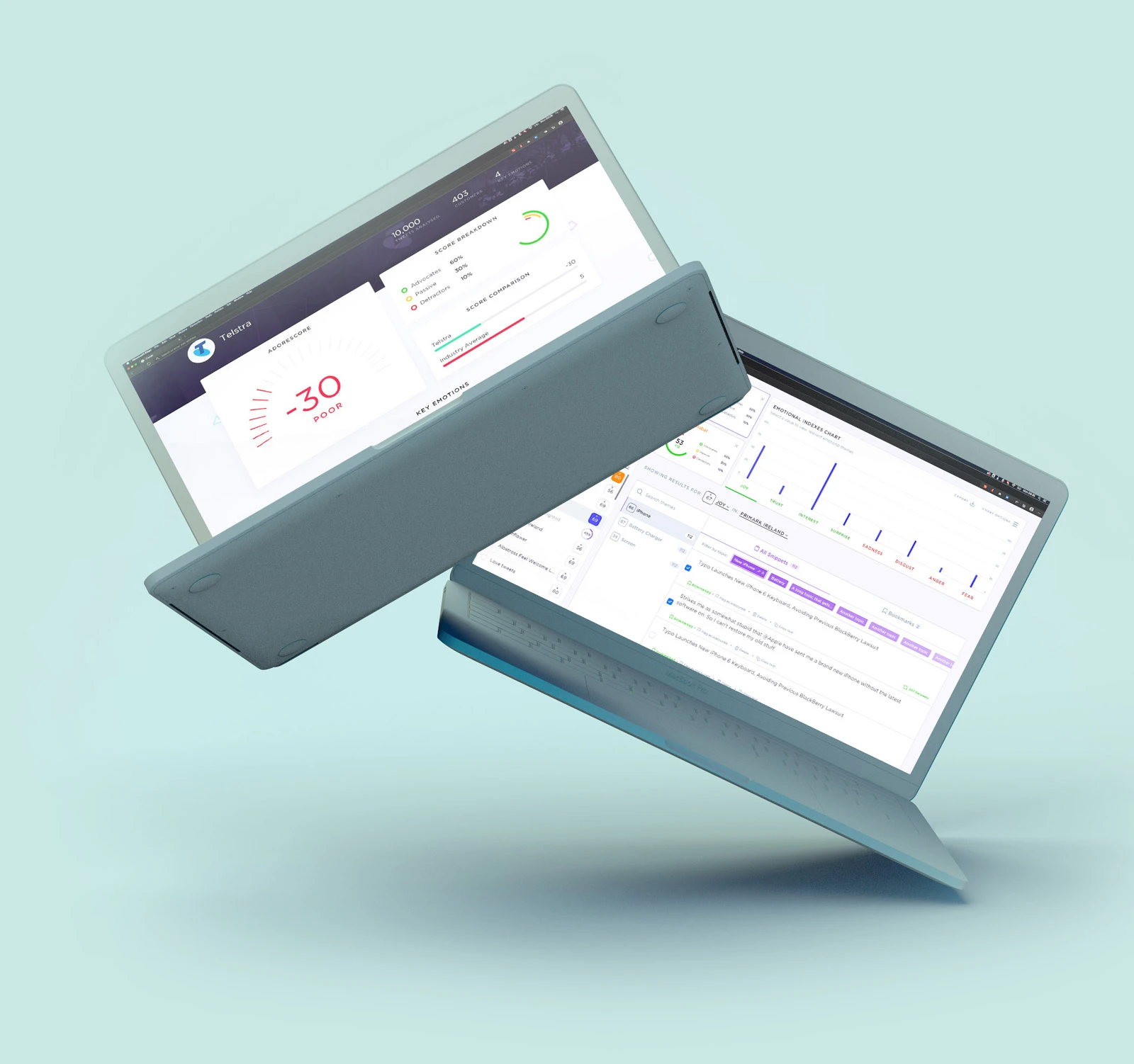
Adoreboard brought me in to work alongside their product team to redesign Emotics, an emotion analytics product. It's used by consultants and agencies to analyse large sets of social data to provide insights for brands and research institutions.
UX Audit
Before jumping in with the redesign it was important to get familiar with their current iteration of the product and start figuring out the pain points. Emotics was still in beta at this stage and hadn't yet been released to customers but the internal consultants were already utilising it for live projects. They proved to be invaluable for gathering feedback on current weaknesses in the product and discussing new features.
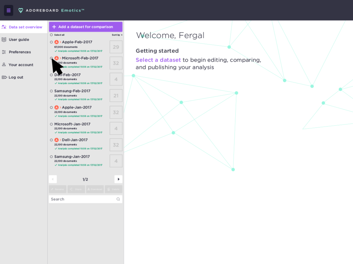
Some of the pain points
- Difficulty uploading datasets
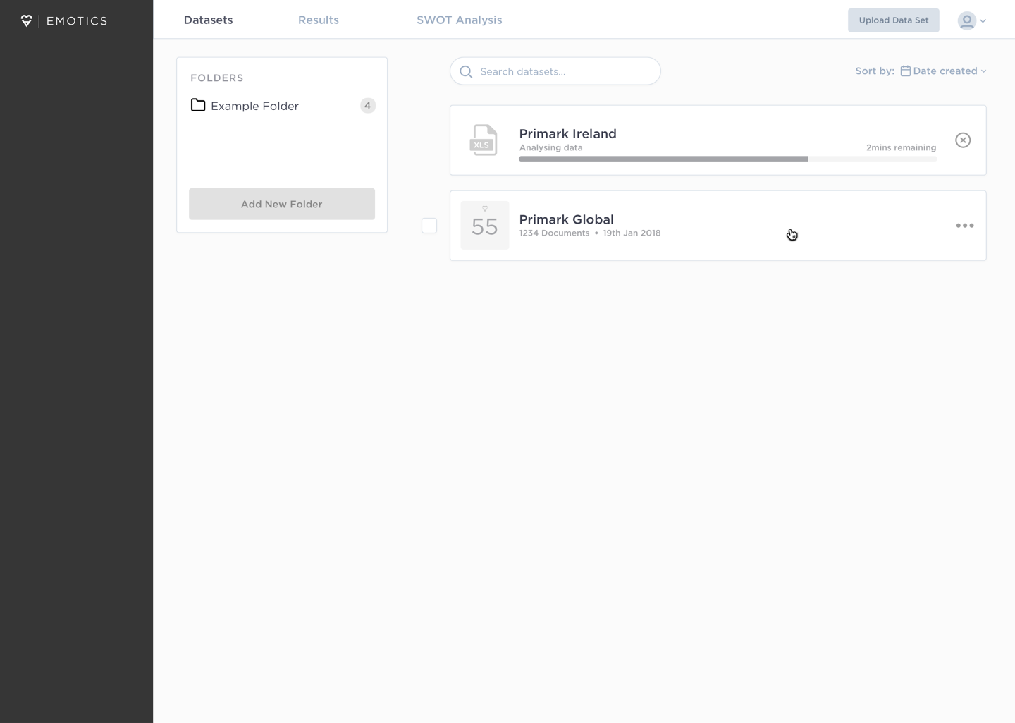
- Sorting through uploaded data via the sidebar is impractical and inefficient.
- Viewing topics and snippets is confusing, with no indication of where to access them or dig deeper for further analysis.
- Too much functionality and actions were contained within the small space of the sidebar.
Low fidelity wireframing & mockups
Once I had spent time with the current product and gathered feedback on the aspects of the product that needed improved, I started storyboarding and creating low fidelity wireframes of the product.
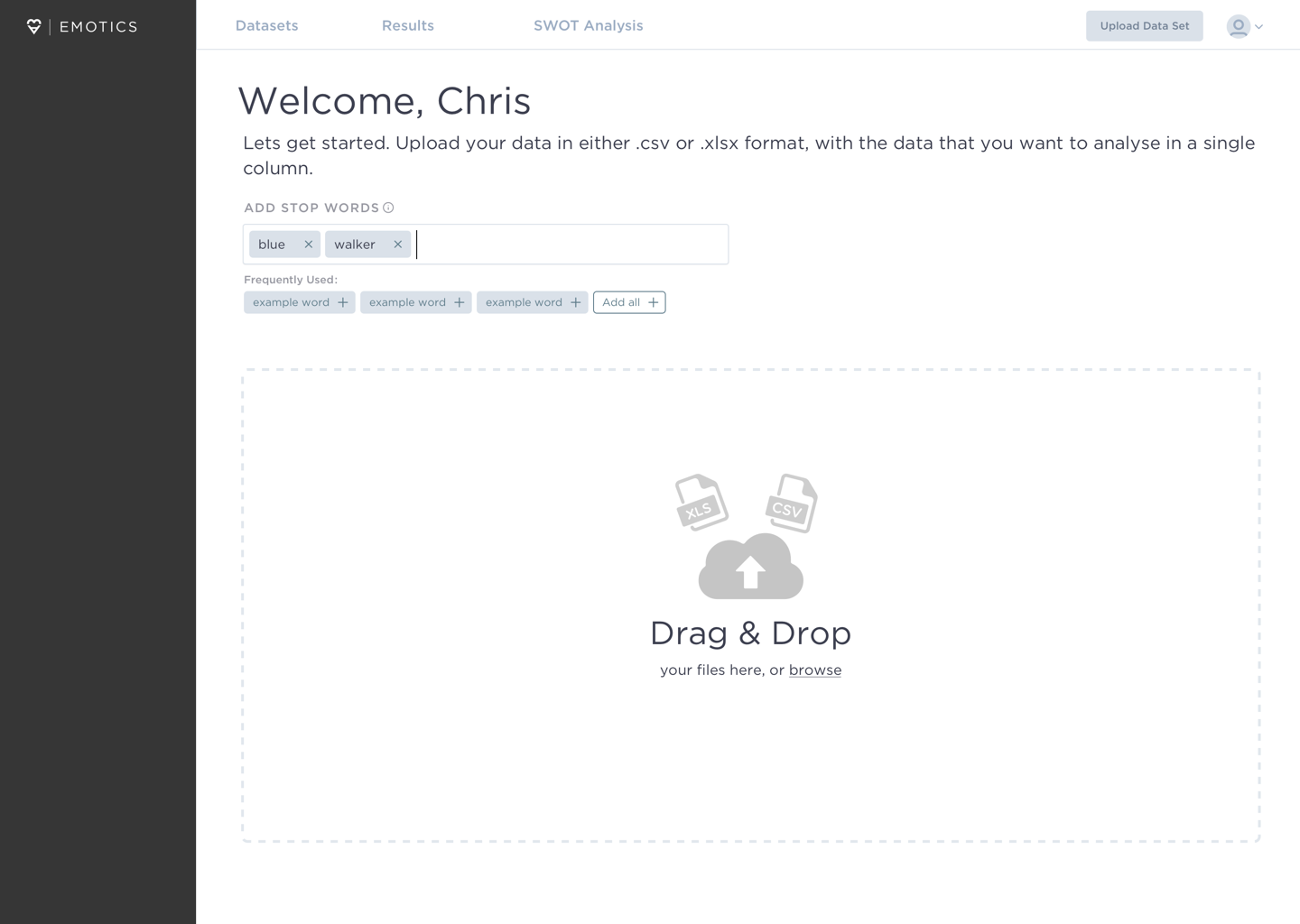
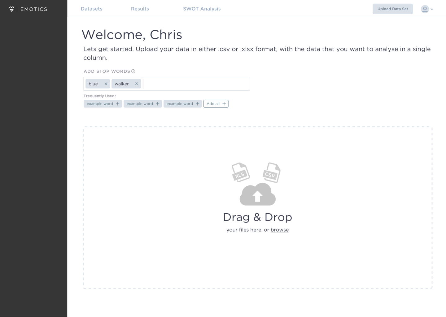
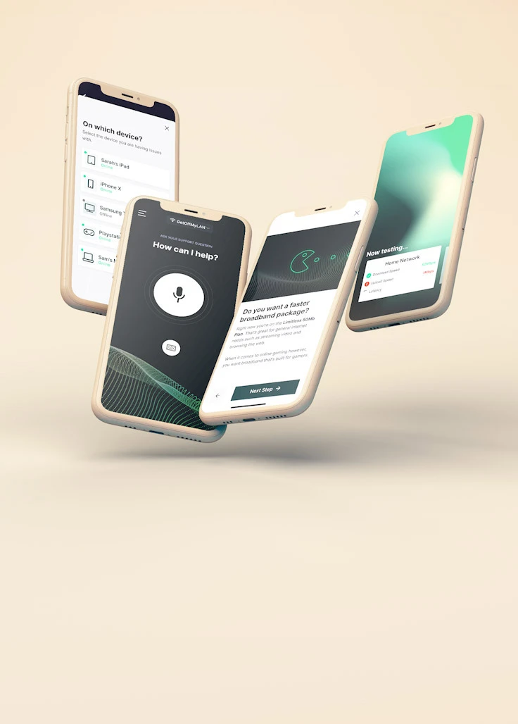
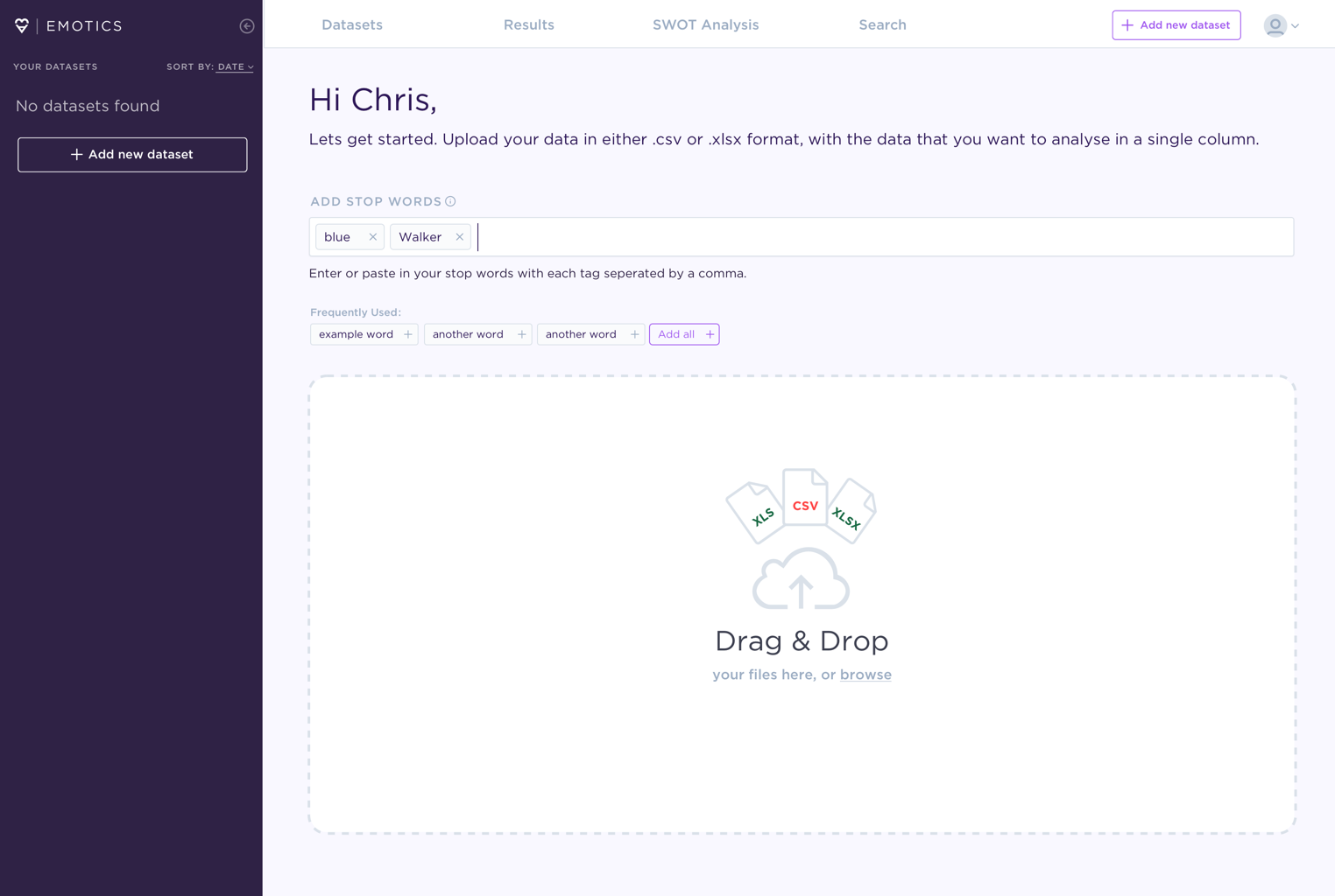
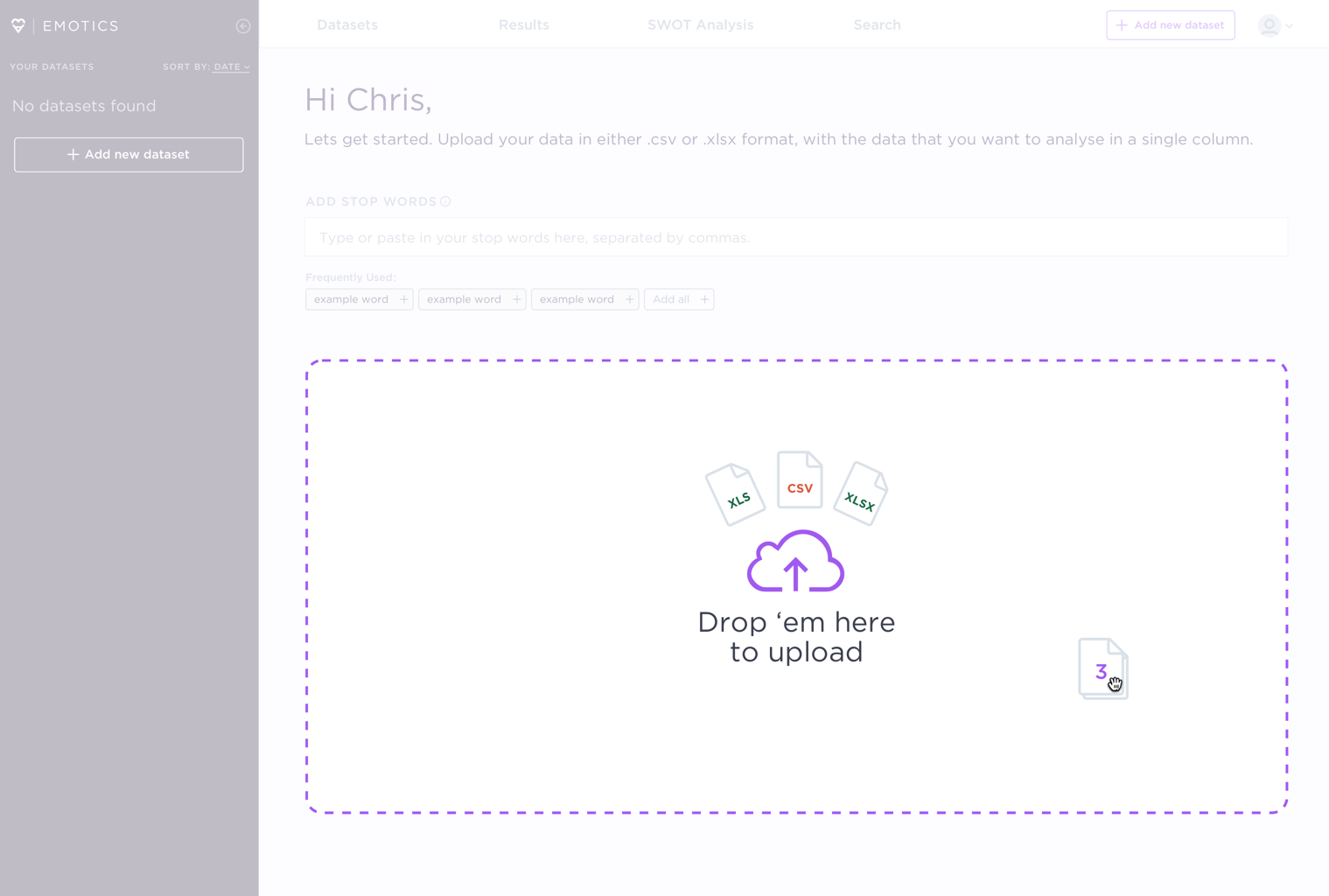
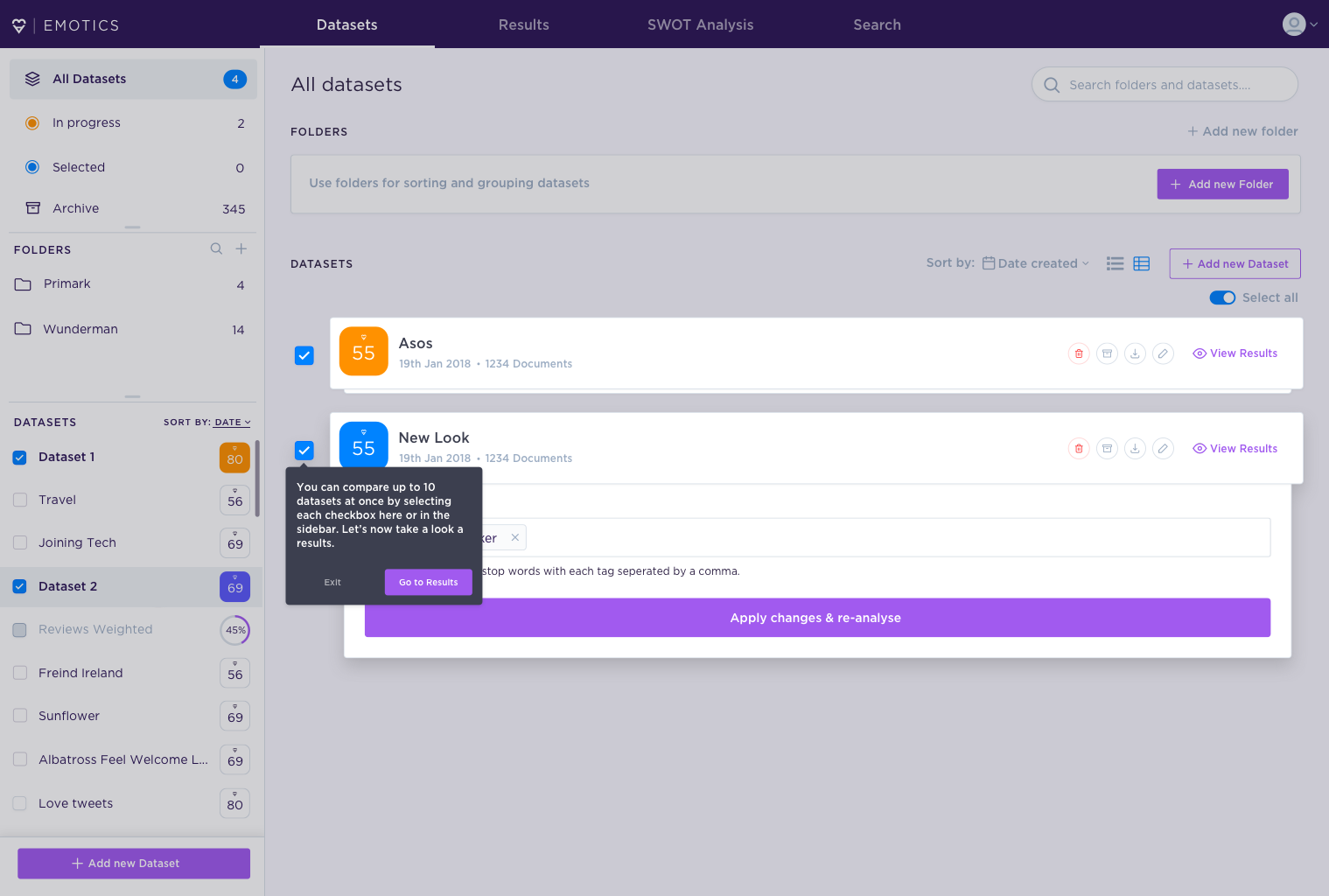
The uploading flow
One of the most important aspects of Emotics is the uploading of data that can be analysed by the engine to process and analyse.
In the current flow, this was done within the sidebar of the app — an area not well suited for such an important proponent of the business model.
Pain points to address
- Difficult to find where to upload data
- Uploading within sidebar is poor use of space
- Unclear which file types are supported
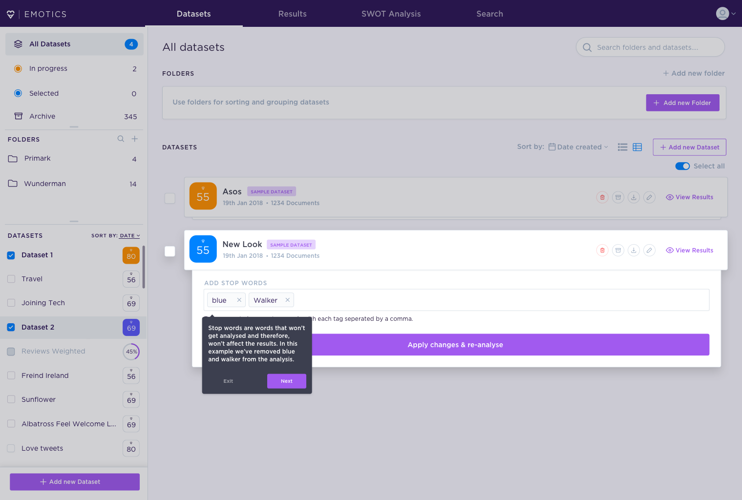
- Adding and editing stop words is cumbersome
- Inability to add frequently used stop words
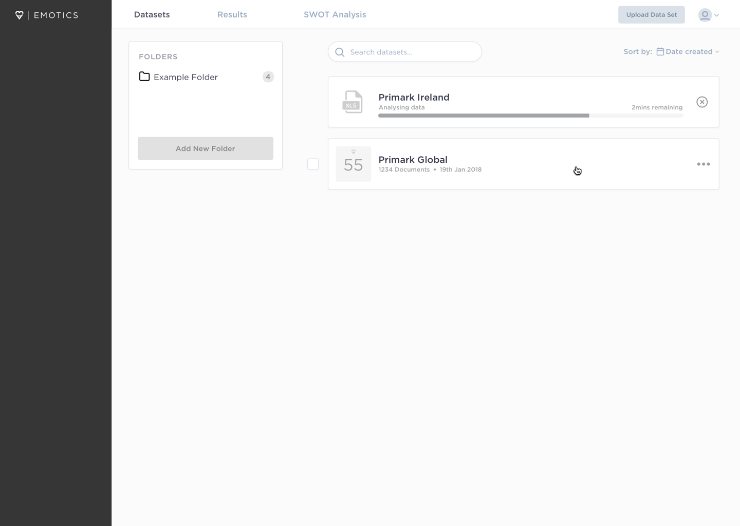
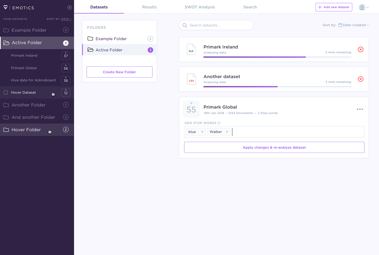
- No organisation for uploaded data i.e folders, grrouping
Components
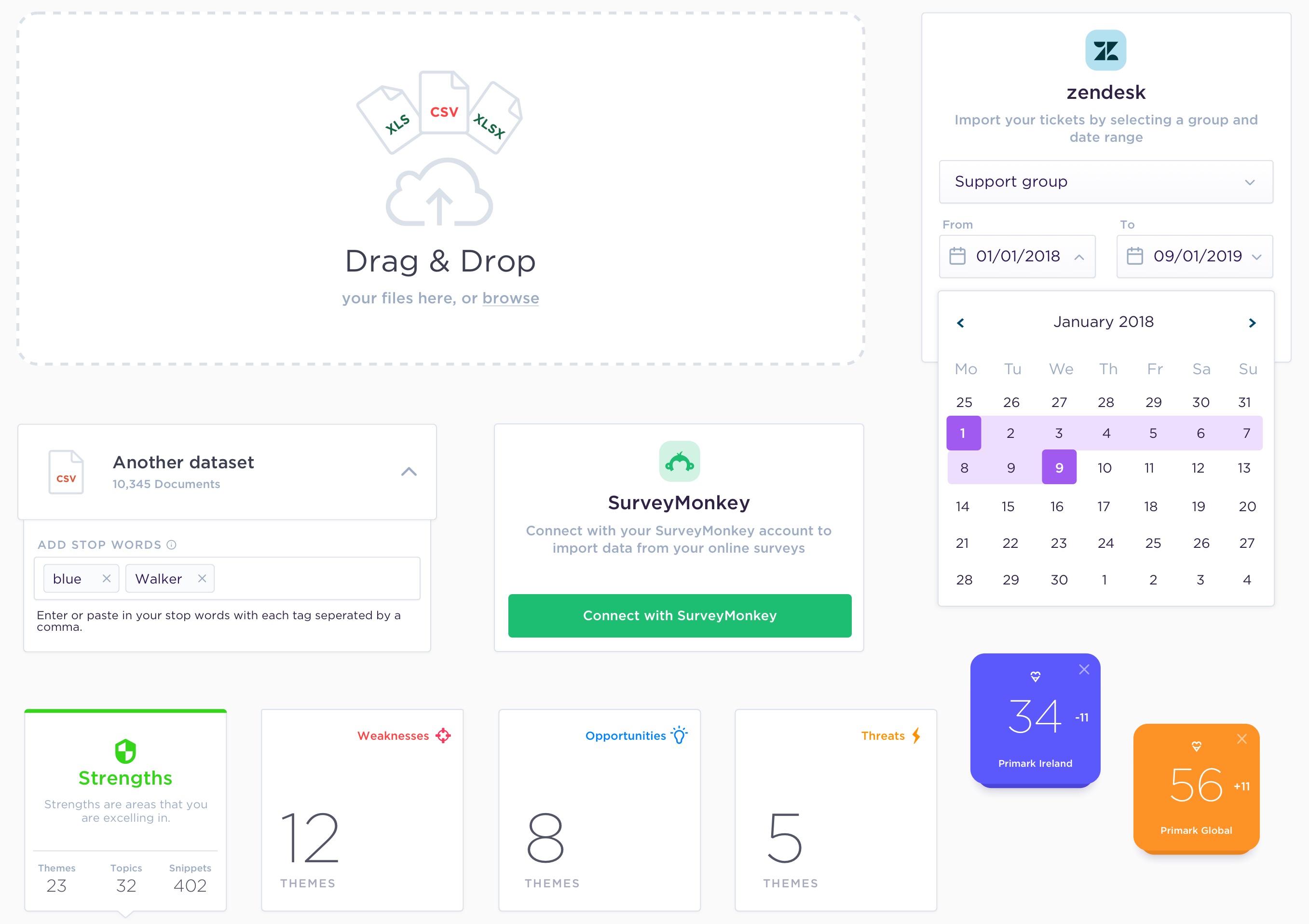
Onboarding
One of the challenges with Emotics is that it is a complex product with terminology and methods that wouldn't be immediately apparent to a new user. They need to be learned.
It was important to educate the user and showcase the value of the product without overwhelming or trapping them in an onboarding flow that overwhelms their mental model.
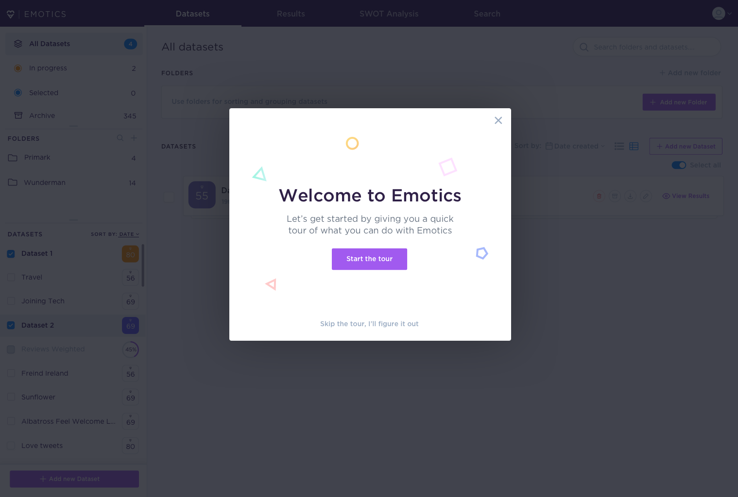
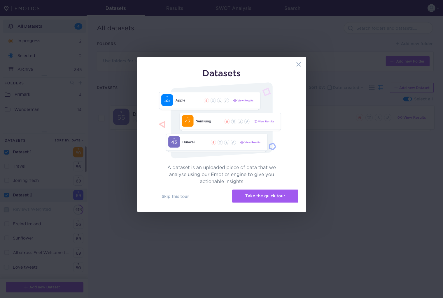
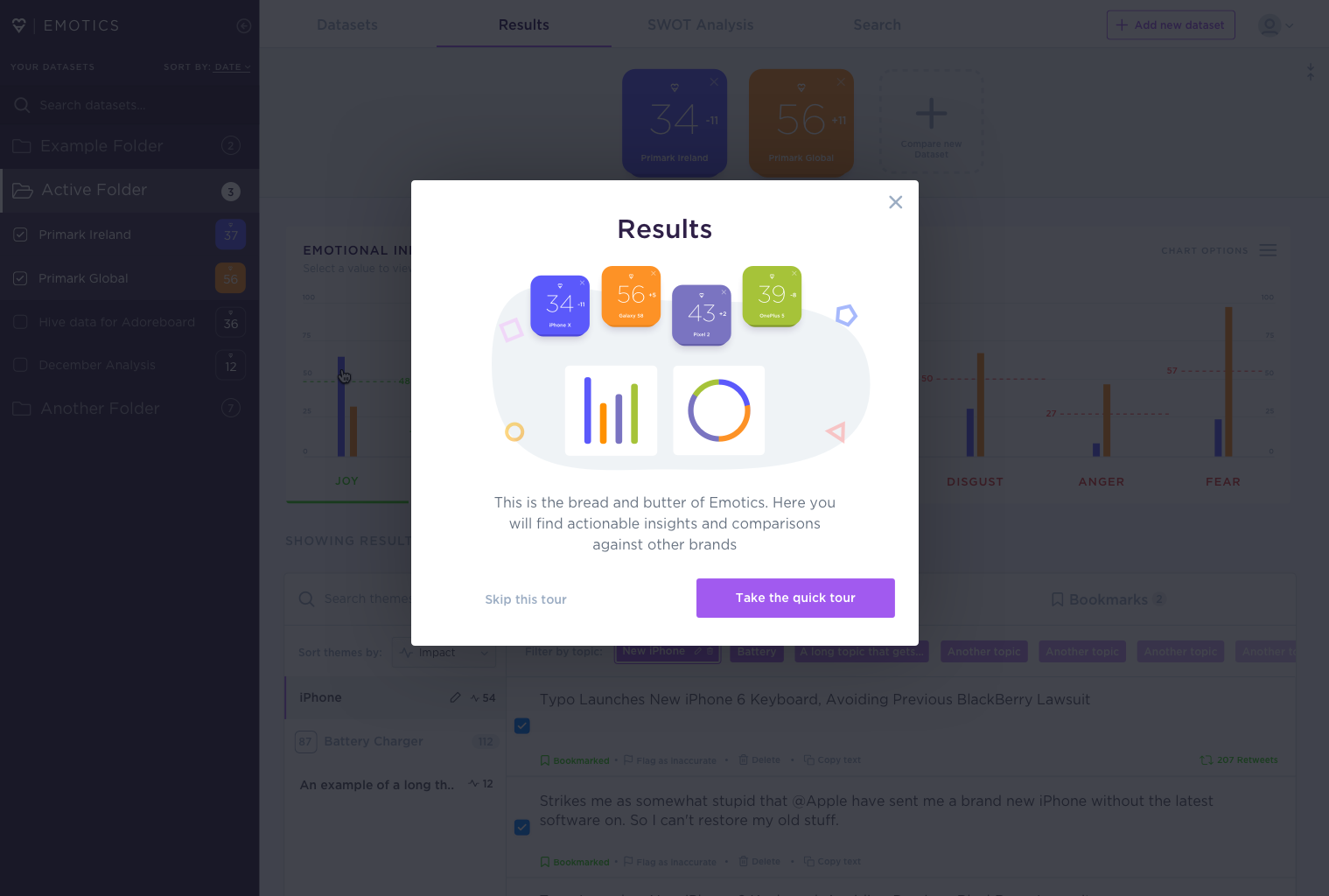
Modals are used to introduce users to each section of the app. Users can take the optional tour, at which point they'll be guided through the key features of that page.
Guided tour
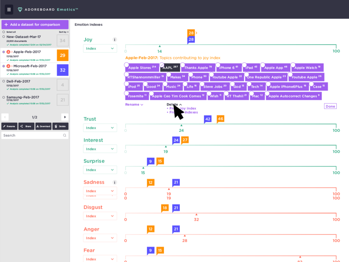
Interviewing customers
One of the interesting things from talking directly with customers was discovering that conventions that you assume would be obvious to the average user turn out to be far from it. One of these such conventions was the "ellipsis menu" that was being used to group dataset actions within a dropdown menu.
It was important to educate the user and showcase the value of the product without overwhelming or trapping them in an onboarding flow that overwhelms their mental model.
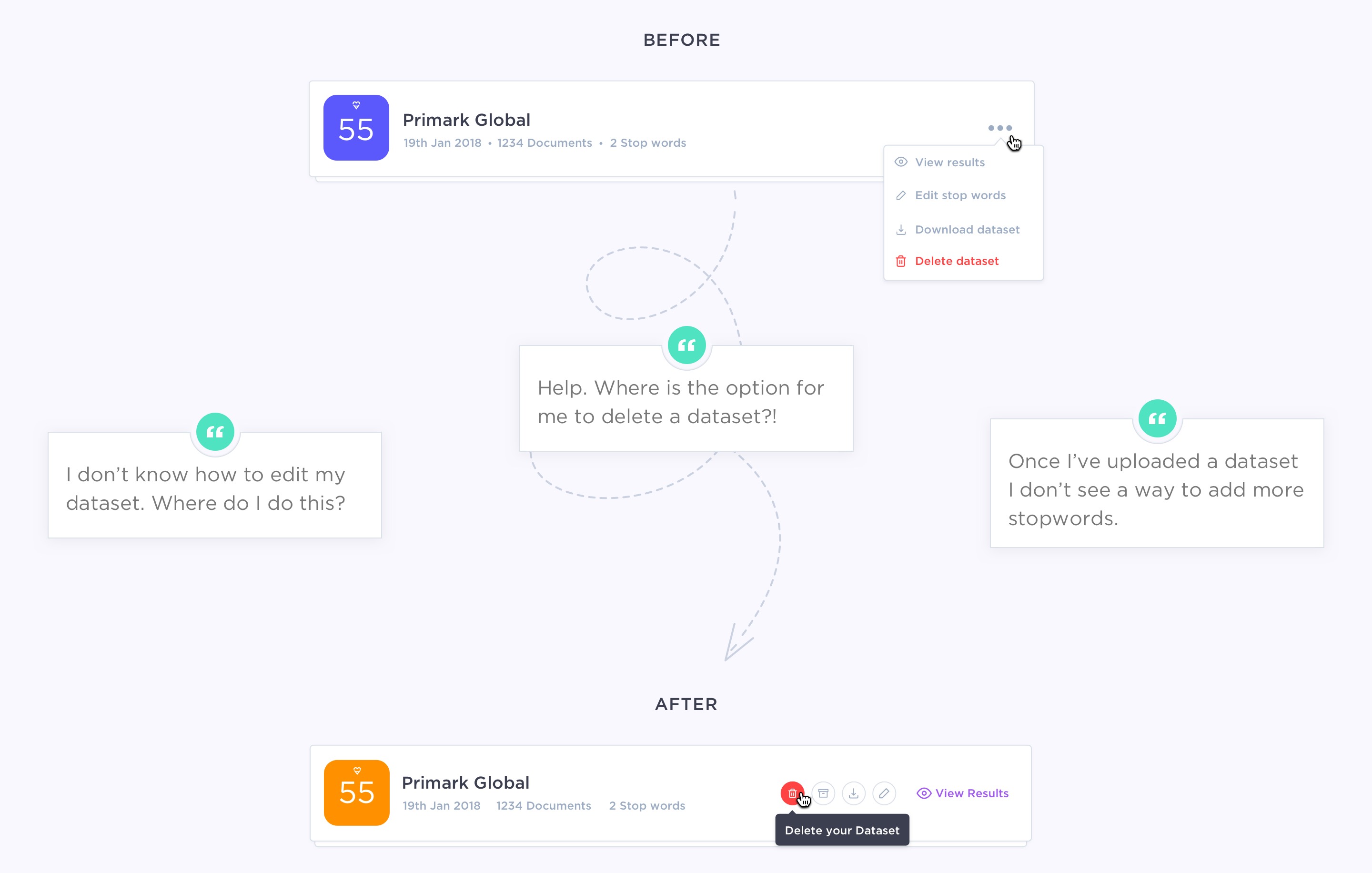
After speaking with numerous users and gaining their feedback, it became apparent that this action was too abstract. They weren't aware you could interact with it. So I redesigned it to make the actions more apparent.
As Luke Wrobleski says, obvious always wins
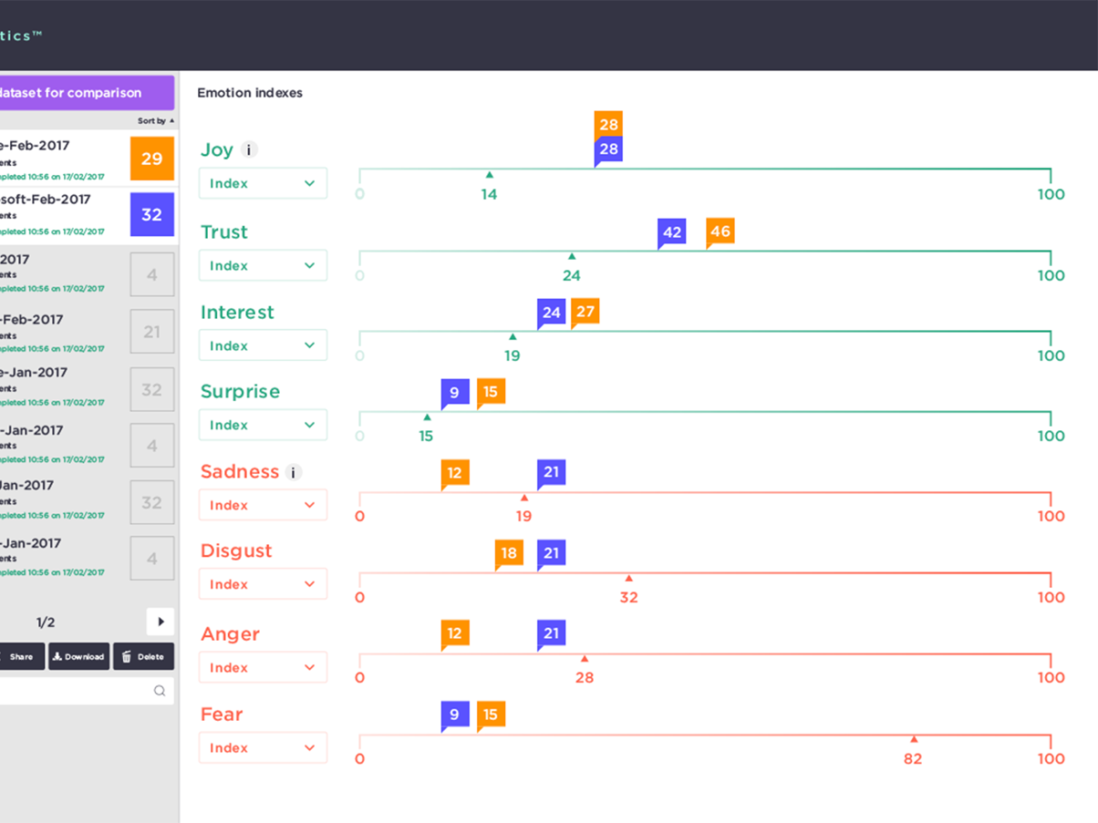
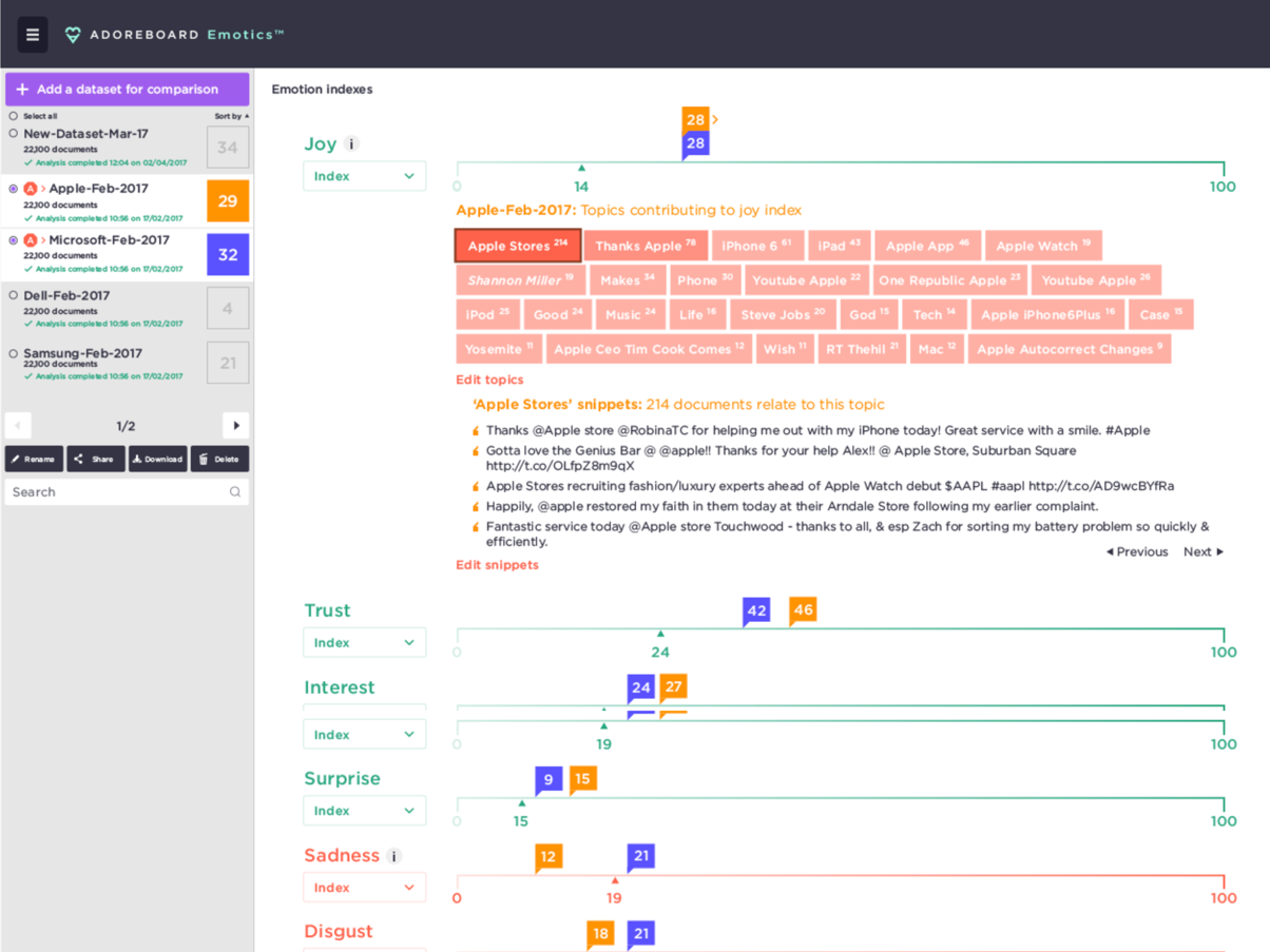
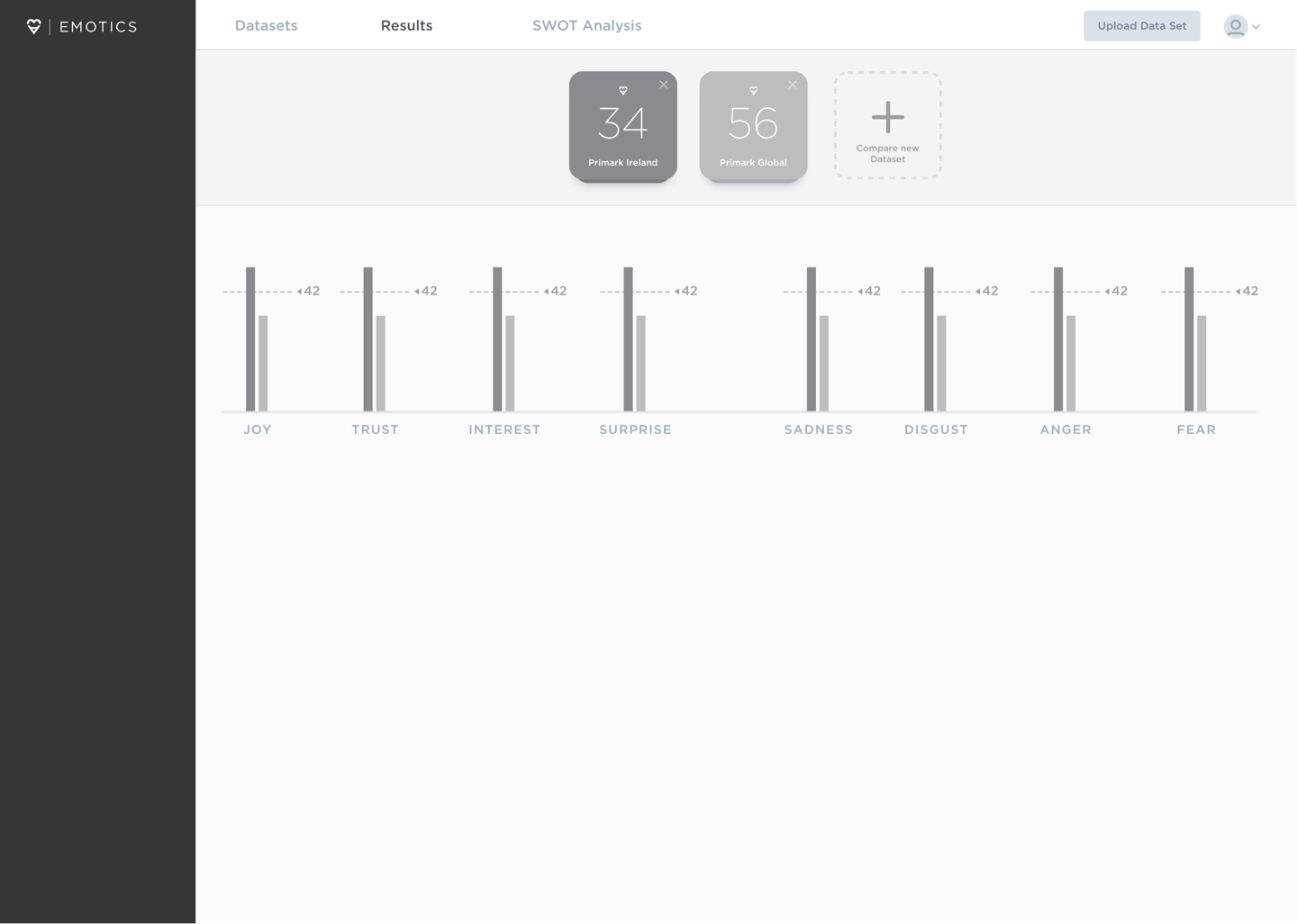
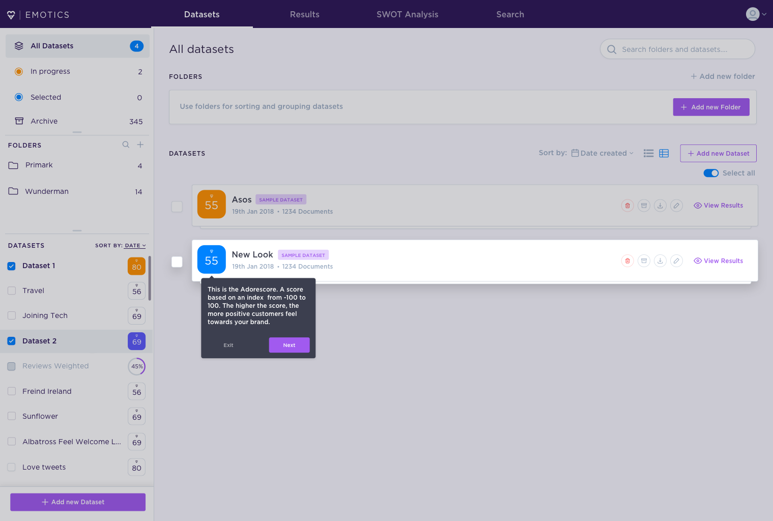
Redesigning the adorescore
The Adorescore (a metric scored from -100 to 100 which allows you to understand how well or badly your brand is performing) is a pivotal aspect of the Emotics product. Discussions within the team however and feedback from users concluded that too much emphasis was being placed on it and that the score, by itself, wasn't a key indicator of the data.
This was leading to confusion from users who felt that the score was too inaccurate and not reflective of the data.
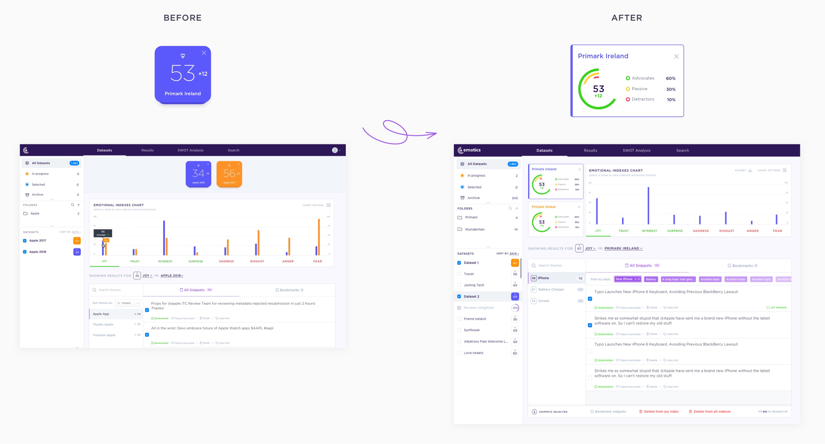
To combat this, I tackled two things:
- Revisit the hierarchical layout to place less emphasis on the dataset's adorescores from a visual perspective.
- Give a visual breakdown of each adorescore that will allow users, at a glance, to distingish if their datasets consists of mostly negative, neutral or positive data.