Case study
Building a multimodal design system
Intro
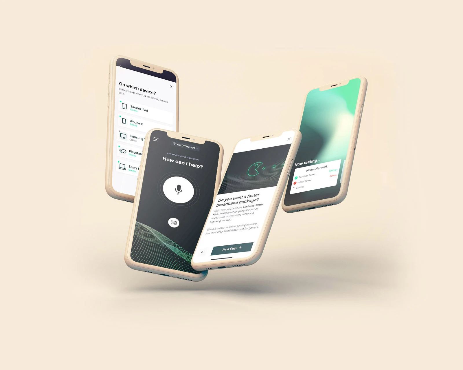
As the mobile design lead at Sweepr I was responsible for designing and developing a design system and language that could be used across different devices and tenants.
How Sweepr works
This video, that I prototyped & art directed, shows an example interaction of Sweepr helping to solve a problem with Zoom.
The problems to solve
- Our custom markup language, SweeprMarkup, was too restrictive and limiting for both design and client requirements. We required a more flexible language to enable these growing requirements.
- There was no cohesive design language or styling framework in place, leading to inconsistencies between projects & clients and an unsatisfactory mobile experience.
- No system in place for interactions other than with a smartphone device meant that our framework was limited.
The component library tree
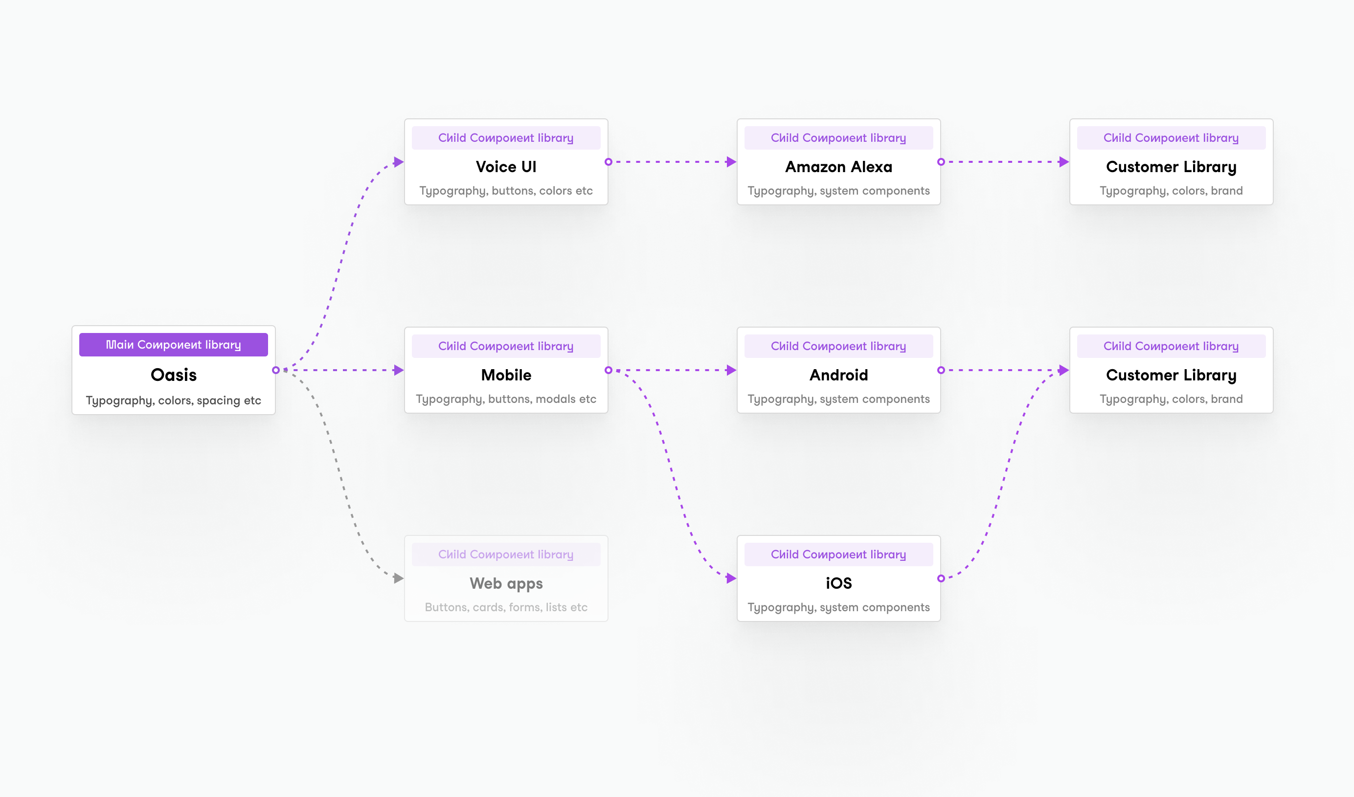
In Figma, our design tool of choice at Sweepr, you can create shared component libraries that are accessible within other libraries.
We used this to create a hierarchy of libraries for use across our products.
The parent library
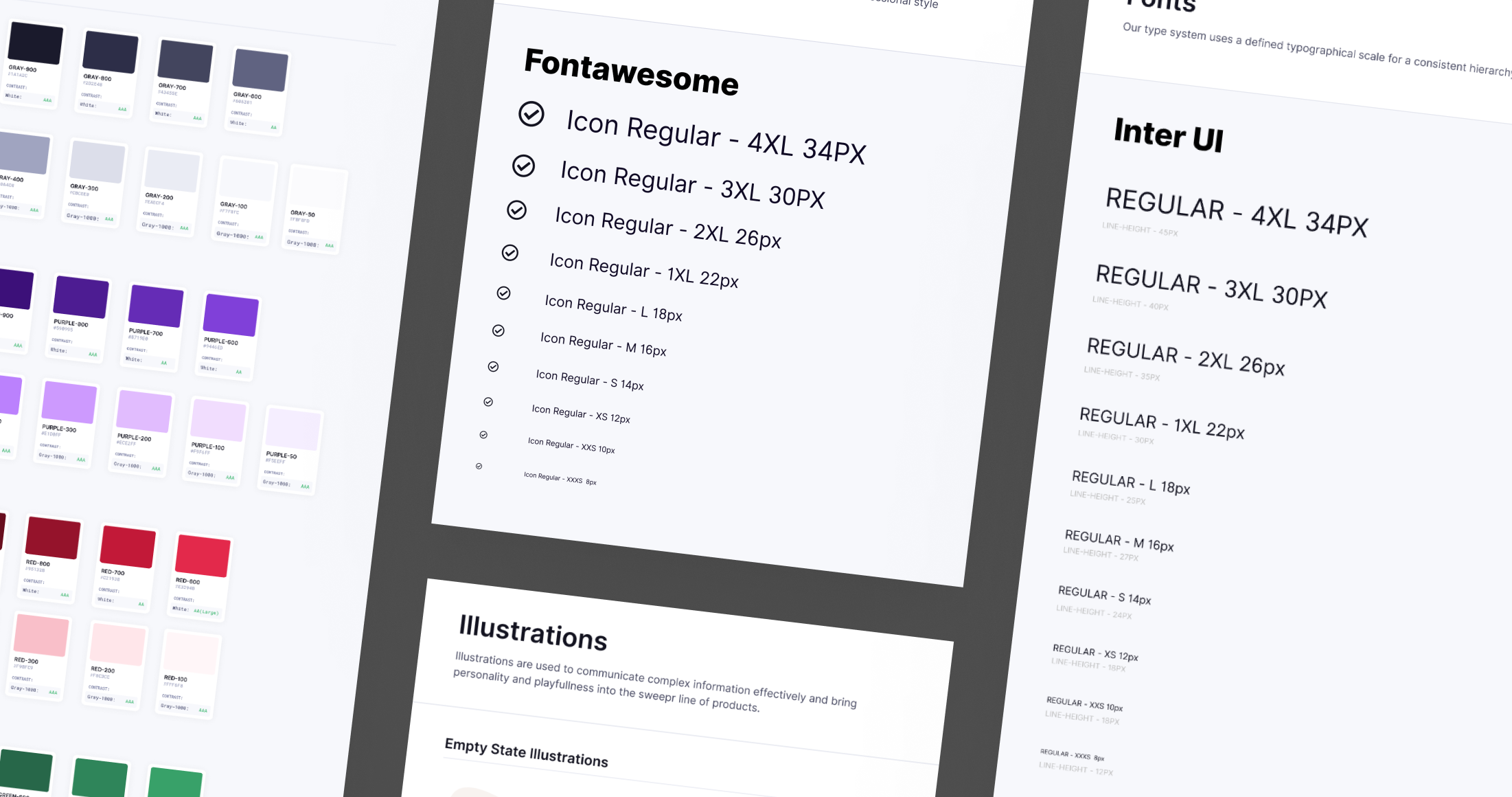
The parent or main library, our design system called 'Oasis', would contain components that could be used globally such as typography, colors, spacing & layout.
Mobile and Voice UI libraries
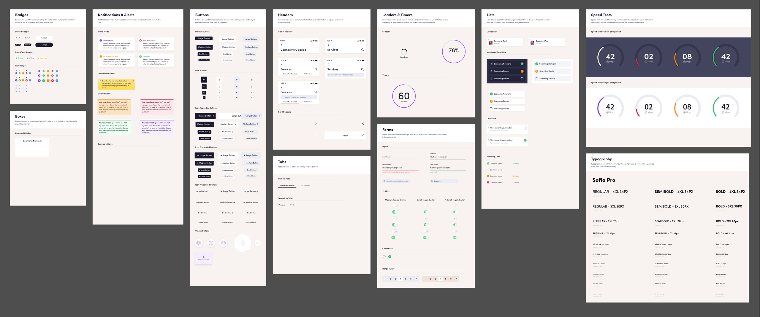
Parent components for that specific medium would be contained here. Such as, mobile interaction patterns, mobile specific components, voice UI templates etc.
Customer libraries
These component libraries would be used for 'overwriting' components from the parent library. For instance, overwriting buttons or typography to fit the brand guidelines of the customer.
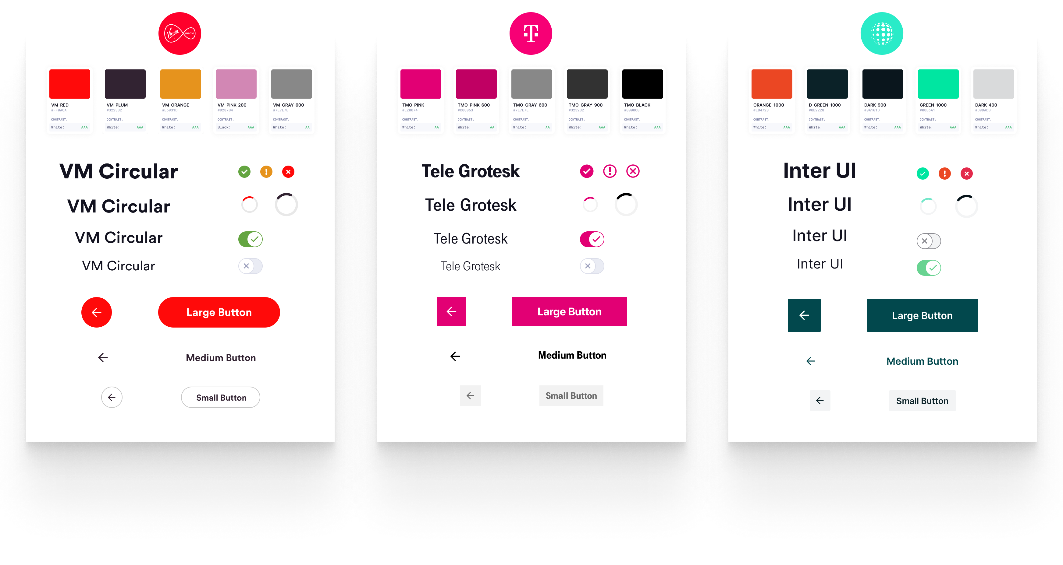
The reason for all this modularity is so that our design system would be flexible and theme-able for various customers. If one customer had a specific request for a certain component, it wouldn't require having to update the whole system.
I was responsible for creating and maintaining these libraries and ensuring they were implemeted for both the design and engineering to ensure a cohesive design system was in place.
Layout templates
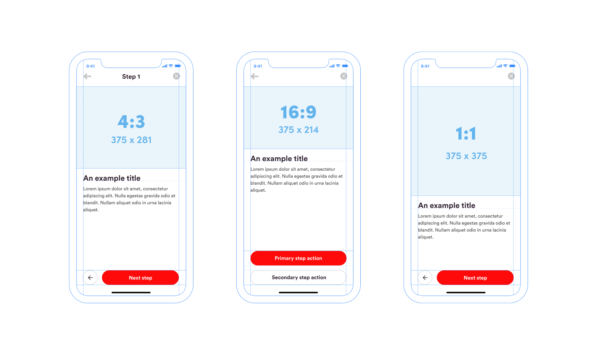
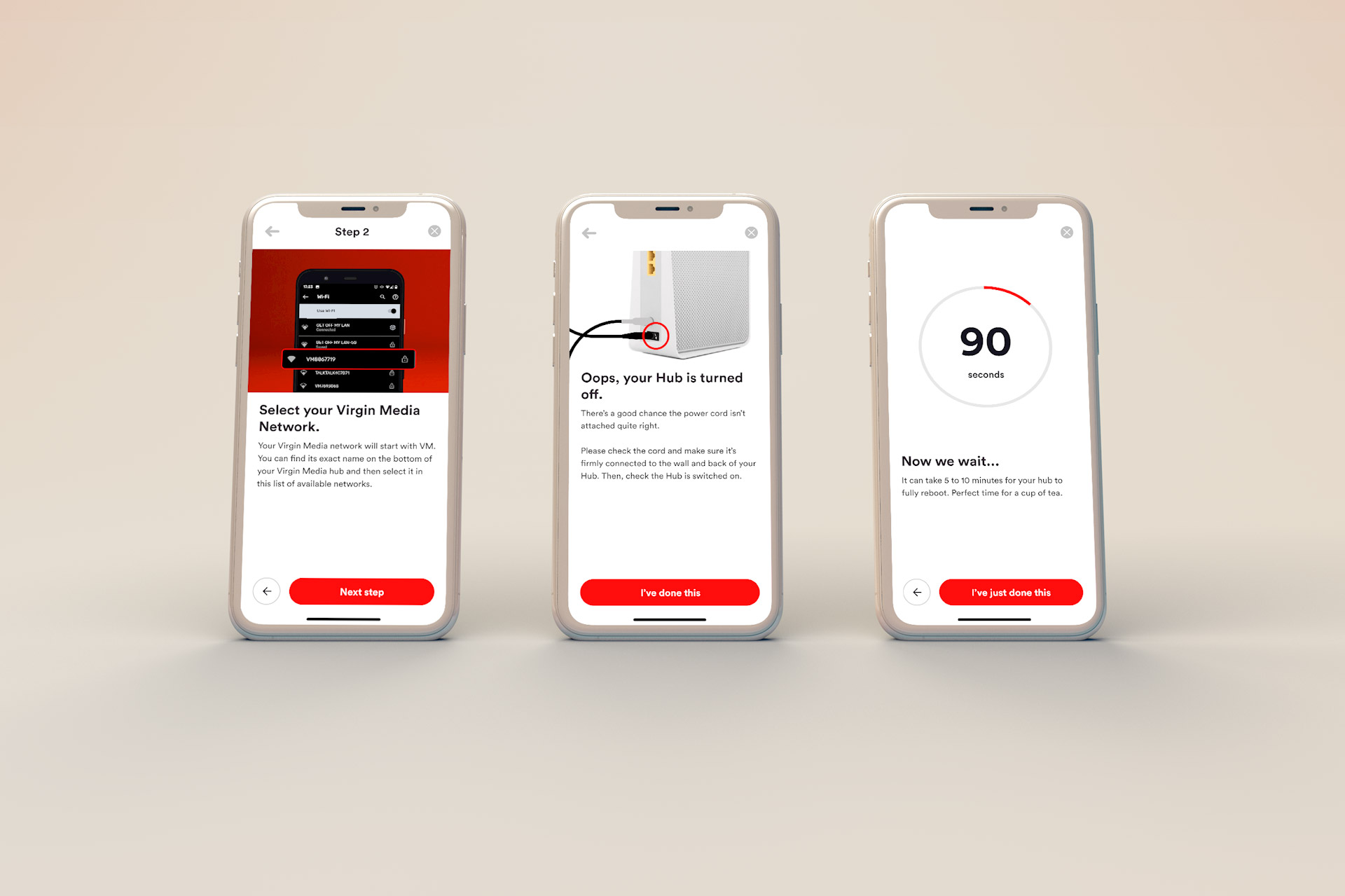
Another problem was inconsistency between our step templates. To help combat this I created 3 layout templates based on the most common media sizes (4x3, 16x9 & 1x1).
Persona based design
At Sweepr, one of our key product features is that we design self-care to fit the technical confidence of the user.
We do this by providing self-care content to fit 3 different persona groups.
1. Confident persona
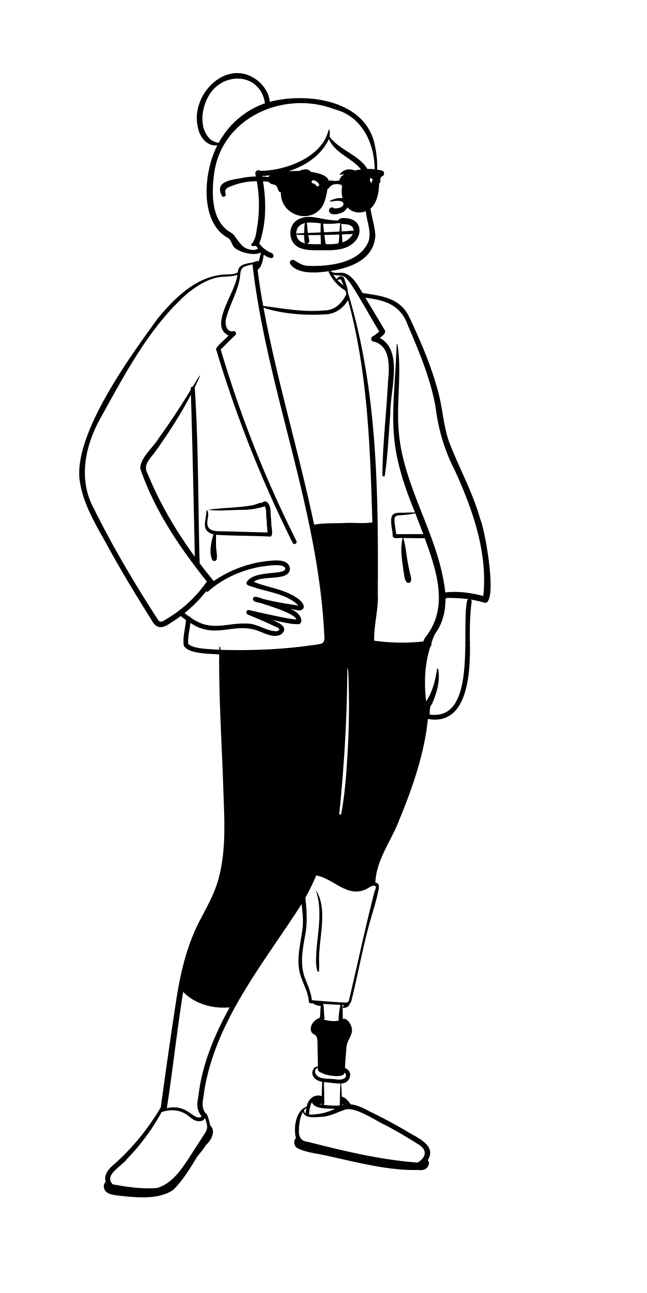
I’m ready for any DIY project. I’m a single mom, so I’m used to doing a lot of things myself – it’s easier, cheaper, faster. It’s good to be self-sufficient.
— Susan
- Usually early adopters of new technology
- Willing to explore technology and solutions on their own
- Not necessarily technical literate but a willingness to explore and confidence that they will figure it out
- Happily embrace tech invading their lives and home
2. Optimistic persona
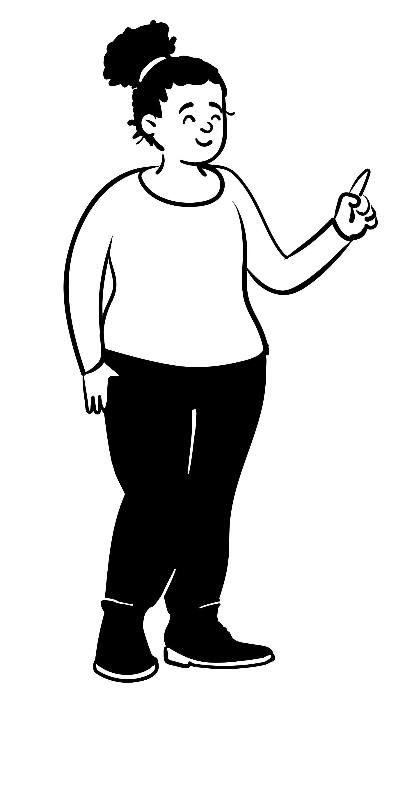
I try to troubleshoot issues on my own before having a professional come out. I really don’t want to have to wait.
— Darcy
- The largest and most variable of the personas
- They’re not sure they can troubleshoot technology, but they’re willing to try
- Not as interested in technology for its own sake; for them, it’s a means to entertainment, communication and a variety of other life-enhancing benefits
3. Avoidant persona
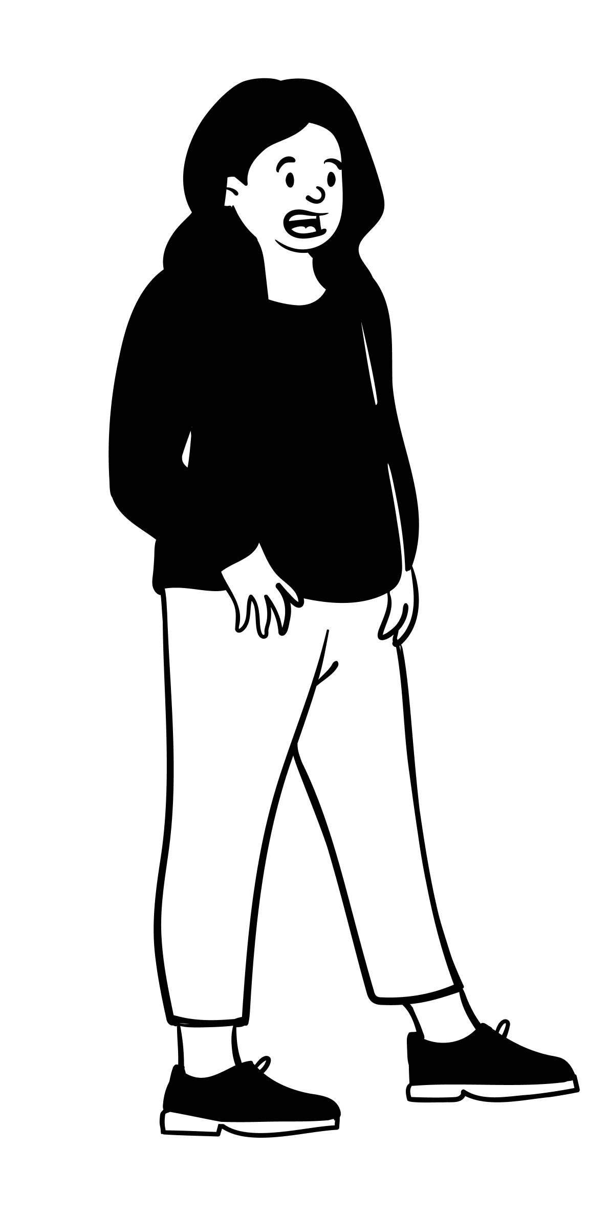
I’d go in with zero confidence. I know how to read and follow instructions but when it comes to technology, it doesn’t work out for me.
— Fiona
- The people that many organizations simply write off for self-service support
- Have a high need for interaction with a human service provider, which means they prefer people for all their service delivery needs
- The type of person that would always go to the human cashier — even when the self-checkouts are free
Differentiating the designs on persona
Because we have these 3 personas, each with their own methods of interacting with technology, it was important to bring these learnings into the designs of our self-care.
One of my first experiments was taking one of Sweepr's key offerings — diagnostics of a user's home network — and creating a new step type for these, based on the persona of the user.
Communicating the status of a user's network is hugely important but for avoidant users all these metrics could be confusing and overwhelming. Therefore, for an avoidant user, we display a simplified version of the diagnostics.
High-fidelity prototypes
I encorporated the idea of using high-fidelity prototypes (created with Protopie) with our designs for user testing and prototyping new features. This provided a number of benefits:
- You can create prototypes that look and feel like a real app without writing one line of code. You can even do voice recognition 🤯
- More stable for demoing and testing than a build
- Making changes on the fly was easier than if it were coded
The problems to solve
- It would take 50-100% more time to create a high-fidelity prototype in Protopie than in Figma (lower fidelity).
- Not ideal for customer projects where timelines were short
- No component library in place means inconsistency between prototypes and more time spent recreating components
Solution: creating an interaction library
As part of our mobile design system, I created an interaction library that meant interactions, components, animations & structure could be shared between files. The results of this spoke for themselves:
- The length of time to create a prototype for a customer project was reduced by 60%
- Greater consistency between files now using a shared library
- Each library could now be duplicated for other customers or projects, which reduced time to create prototypes across the board
- Creating high-fidelity prototypes for timely customer projects went from a 'nice to have' to 'key process'
Designing and building an Alexa design system
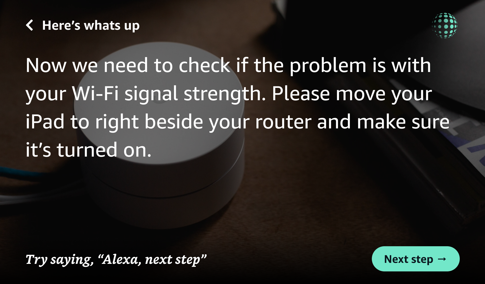
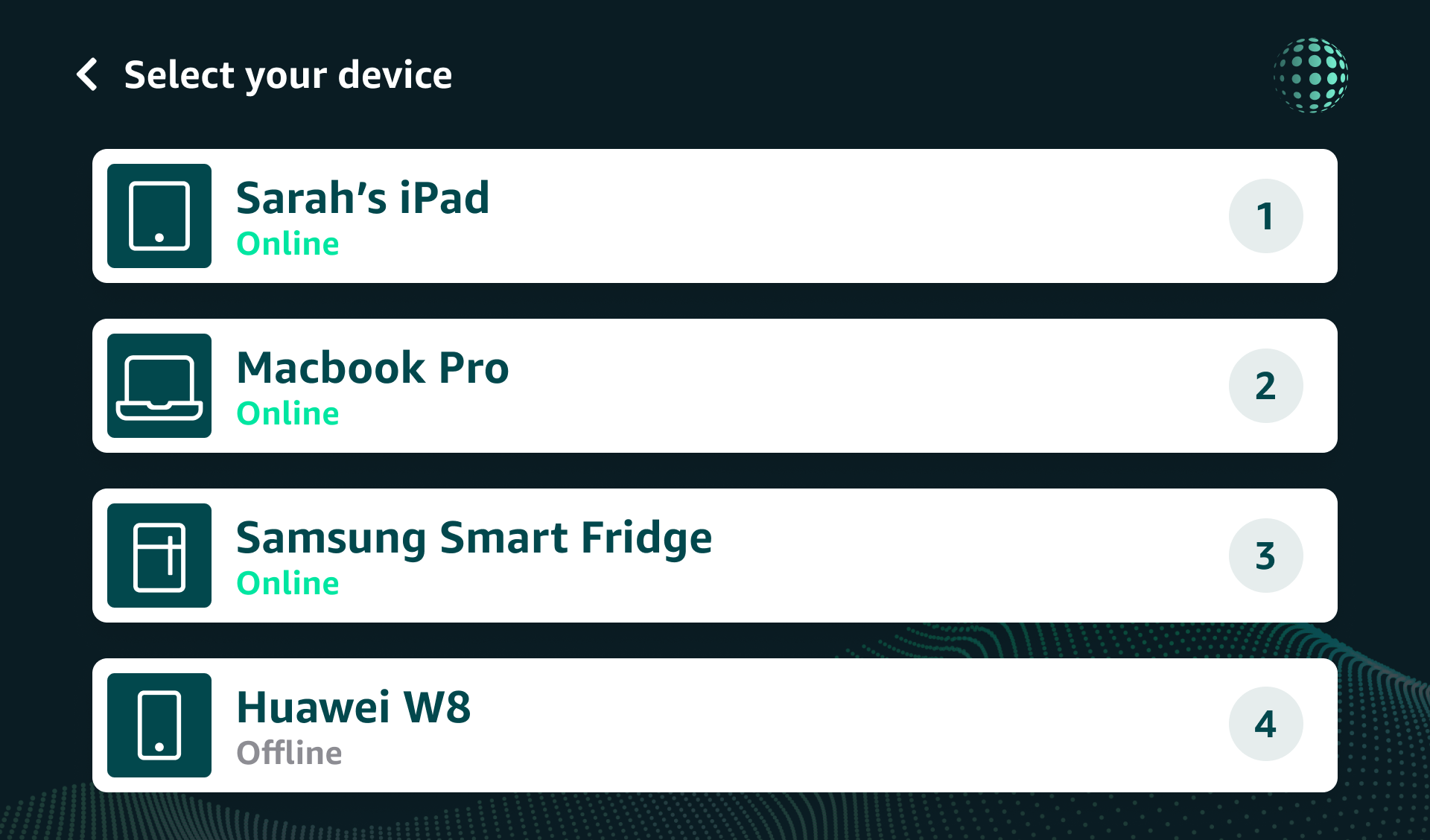
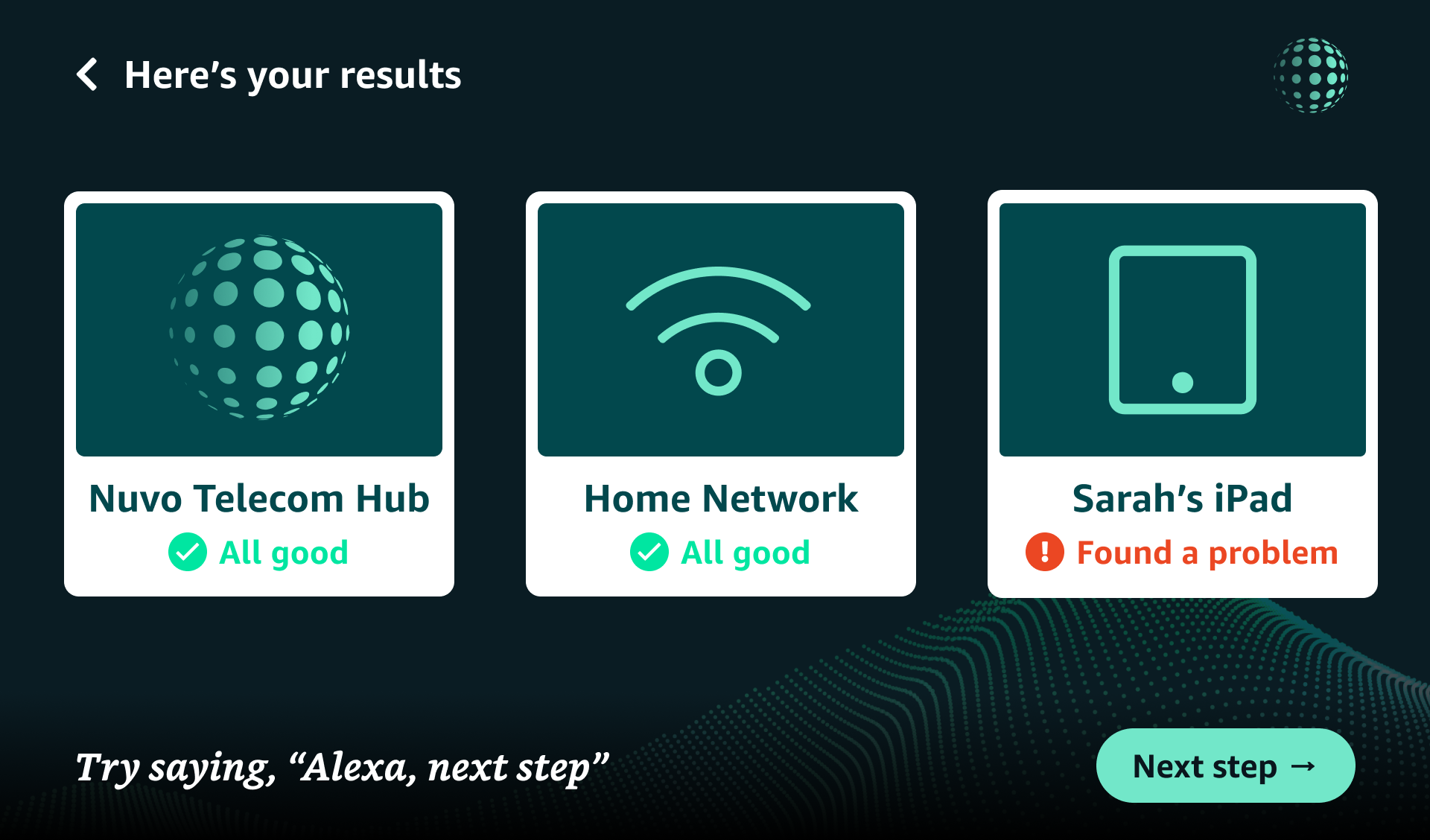
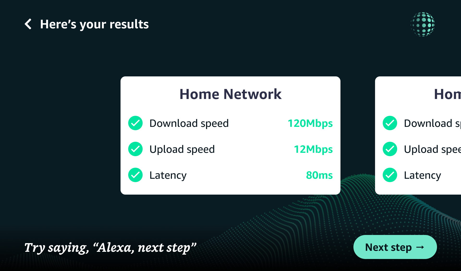
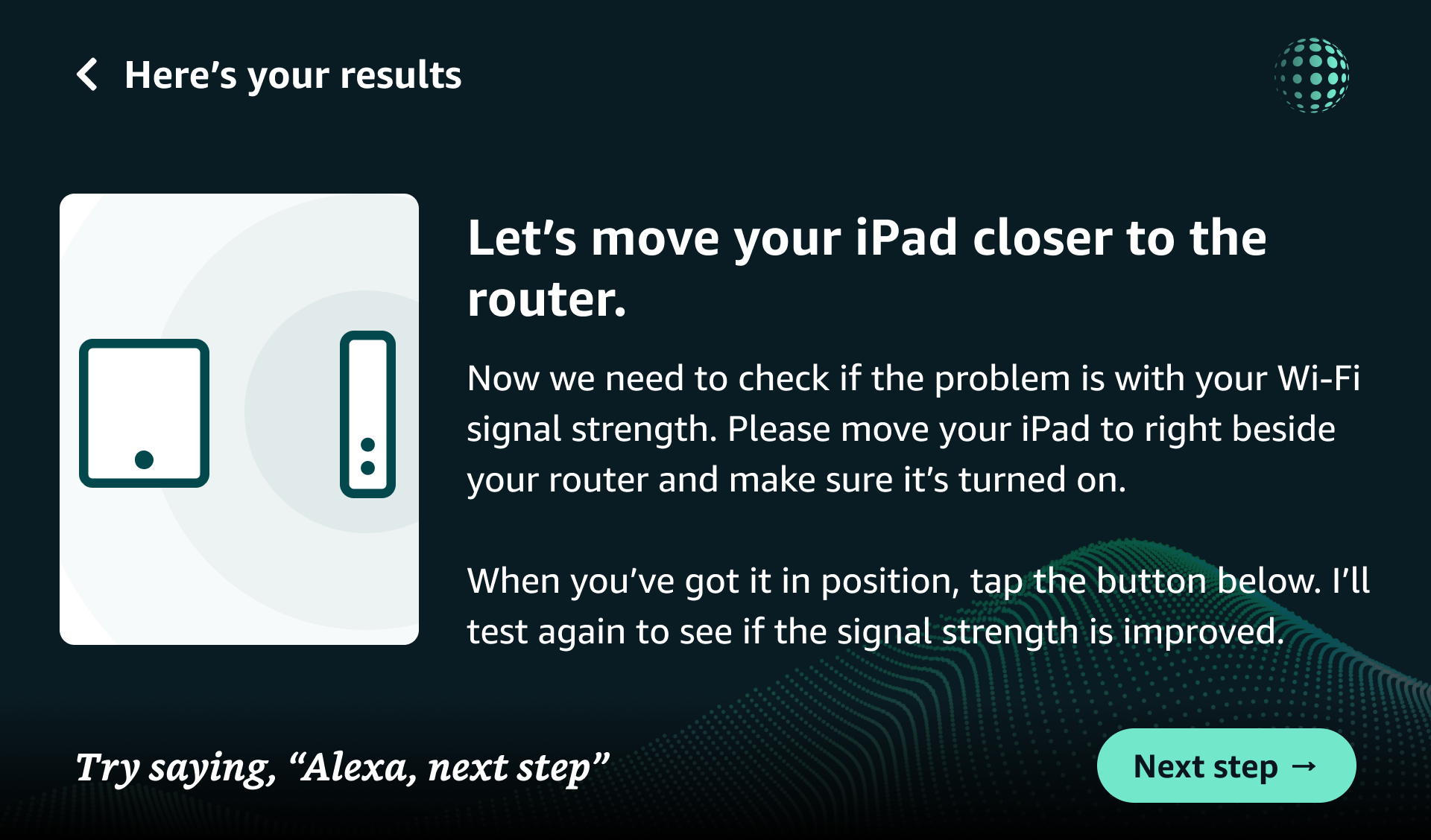
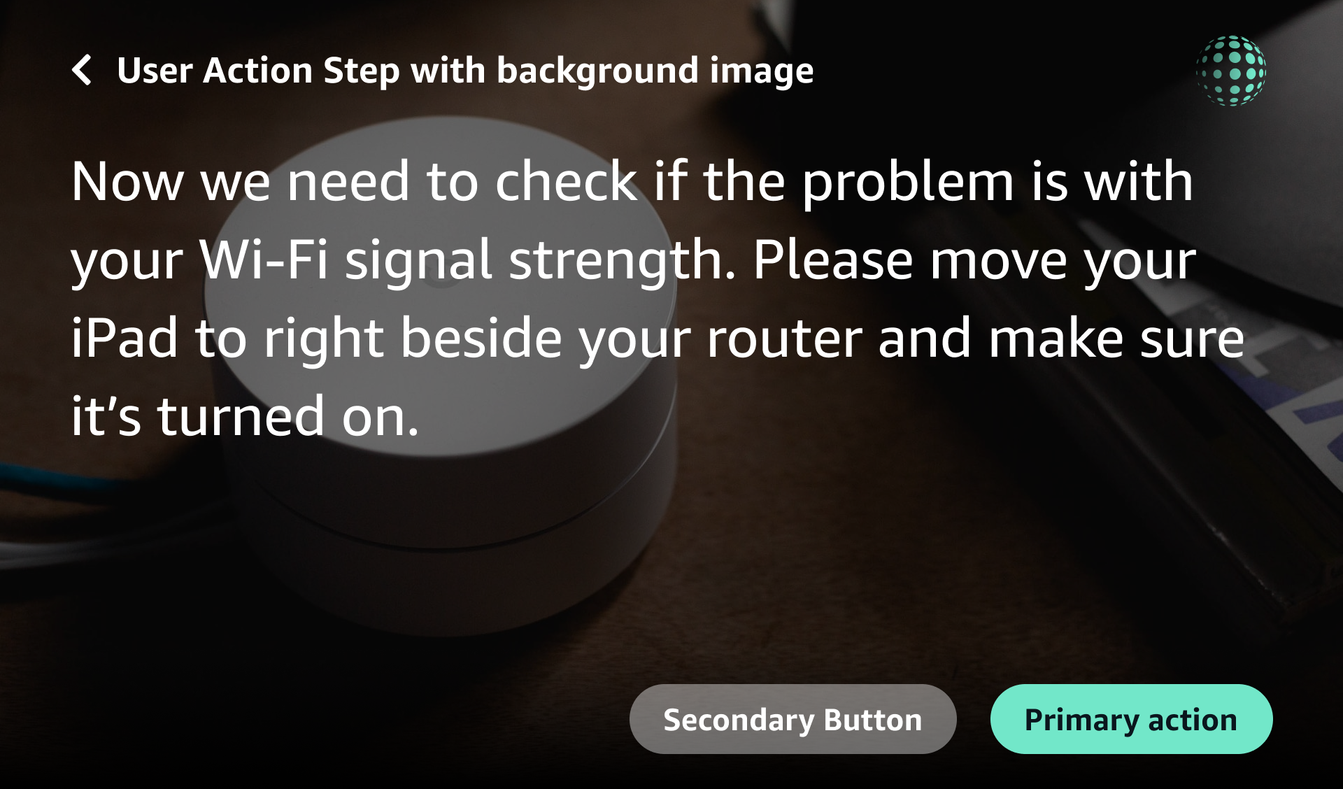
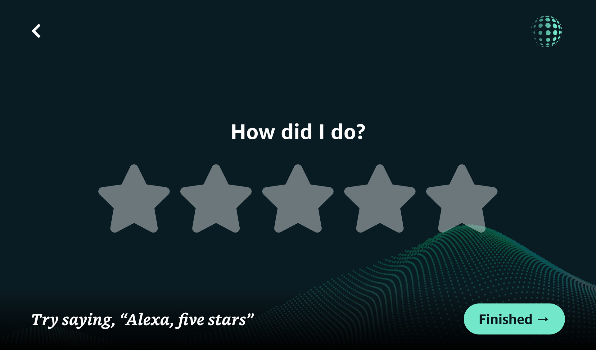
A client had requested a POC of Sweepr running an interaction on an Alexa Show device so I was responsible for designing our step templates to fit into Alexa's design language and then taking the designs and developing a Skill using APL — Alexa Presentation Language.
Constraints
Working with APL and Amazon's design language was interesting. There were a particular number of constraints and limitations to overcome and adapt to. When it came to creating the steps in APL, you were quite limited with what you could do. For instance, being limited to Amazon's typography, no animations, limited styling capabilities etc.
Developing Voice UIs
Alongside our copywriter, I worked on designing and developing voice UIs to accompany our usecases to make them truly multimodal.
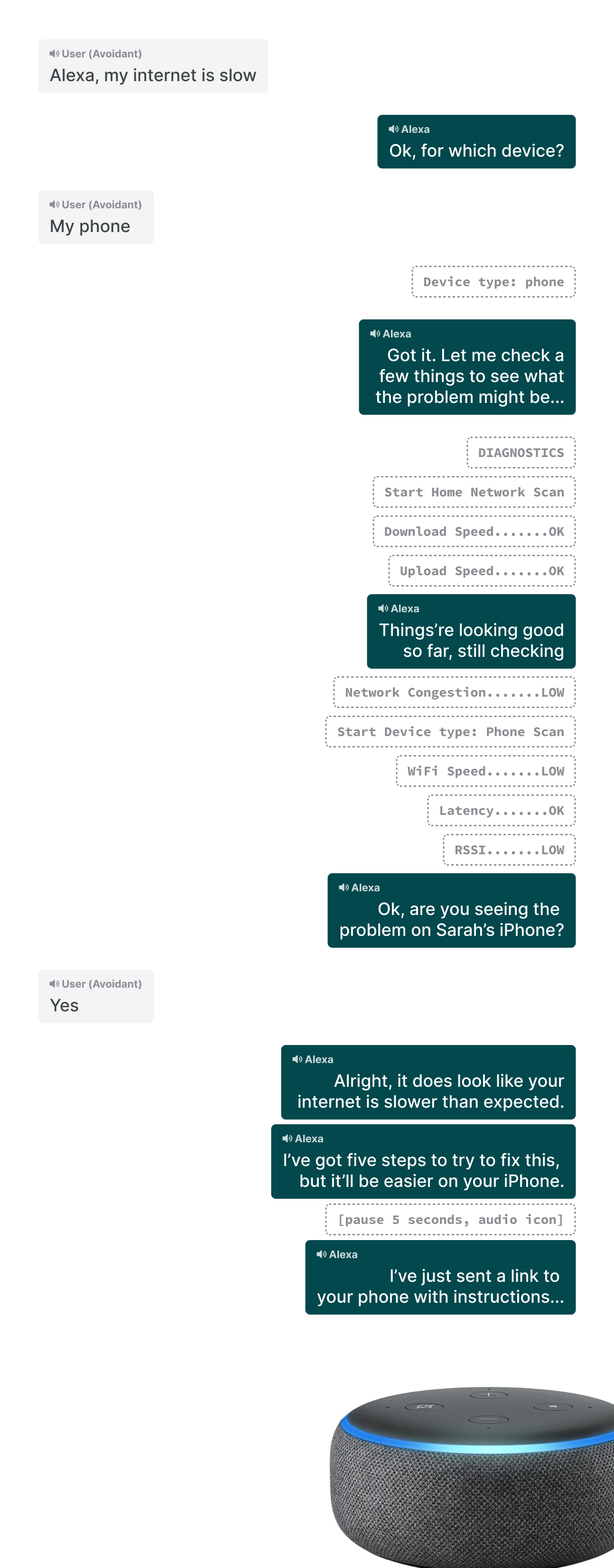
In conjunction with this, we also expanded our design system to support voice UIs, taking into account tone of voice, pacing, length etc for our 3 different persona groups.
Developing the front-end for our mobile design system
I also worked as the front-end lead to play a key role in switching from SweeprMarkup to HTML for our step templates. This involved:
- Creating compliant, performant HTML for each of the step types on our framework
- Writing ES6 Javascript to power the interaction layer
- Creating a CSS system that is small, modern, flexible and themeable
- Designing & developing a documentation site for our design system, Oasis
Oasis documentation website

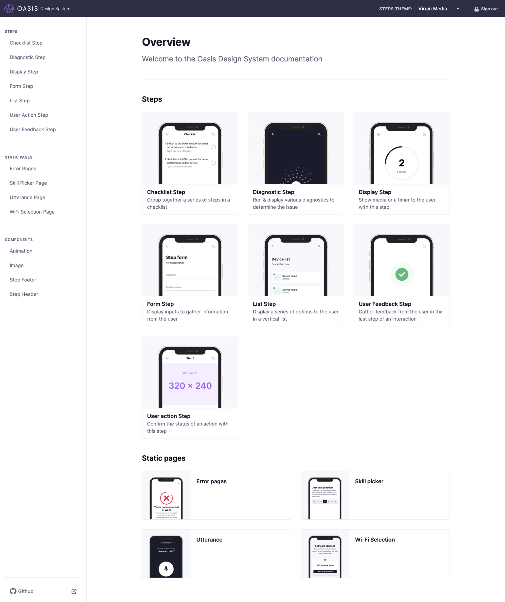
I created a comphrehensive documentation website to showcase and explain the Oasis design system, its components and the step types.
For those nerdy enough to care, the tech stack was as follows:
- Jekyll for static site generation and content management
- Tailwind for powering both the CSS for the documentation and the framework
- Gulp to browserwatch, minify and treeshake the CSS and compile JS
- Localstorage-enabled theme switcher and device preview to view different customer themes at different phone sizes
- Firebase auth for handling login


As a now fully-remote team, communication and staying in sync becomes more challenging. Especially when I was now working between both design & development teams. This meant that communicating my changes, feedback and process had to be vigilant. For each step I implemented:
- Version control and changelog for tracking and documentating changes
- A code preview for the HTML and JS for each step, along with the last time it was updated
- Documentation outlining how the interaction of that particular step functions
- A phone preview and theme switcher so developers can quickly switch themes and devices
There are not words adequate to describe Michael… unicorn, perhaps, but any word would be inadequate to convey the depth of his talent, collaboration and empathy. I was lucky enough to hire him onto my Design team and be his collaborator for two years. He made me better, as a UX pro and as a person. Michael easily moves between vision, design execution and building, seemingly without breaking a sweat. Yet, he’s also humble. It is a powerful combination.
As his copywriter, I adopted a mantra: WWMR? (What Would Michael Read?) to bring conciseness and clarity to the words I added to his UIs. As a researcher, he eagerly learned to make high quality observations and interpretations of user behavior during usability testing better than researchers who’ve been working for years.
I unreservedly recommend Michael for his initiative, strategic thinking, flawless execution and kindness. You will be better for having worked with him.


