Case study
Reinventing customer care for the home
Intro
At a Dublin-based AI startup, I lead design of the mobile customer experience. We created an app that users would use in their homes to self-diagnose and fix their home technology problems.
The current product
This video I prototyped and art-directed demonstrates how the product works to date.
User research, feedback and product maturation had demonstrated some of the flaws with this current approach, so I started to explore a new design.
User testing & research
Working collaboratively with a researcher, we quantified the impact of usability problems to prioritize high-impact issues that would interfere with users’ desire to use the mobile app.

To rule out making changes based on either low severity or low frequency, only issues that scored high to moderate impact* were considered.
*Impact score is severity of the usability error (1 – 4) multiplied by frequency of the usability error

One of our highest impact issues was users’ reluctance to use the voice interface to identify technology problems in their home. Our users said:
I'd probably type it because when I speak it, it always has a hard time recognising my voice.
It's concerning because of all the hacking stuff like listening & spying.
I wouldn't use it because I don't know how articulate it is, like if I say a codeword if it would actually understand.
In addition to issues with voice, there were also concerns regarding the voice interaction page as a whole. Such as:
“WTF do I say?”
A lack of visual prompts for utterances can lead to cognitive delay for users on how to interact with this channel.
“WTF am I looking at?”
Low user familiarity with this type of support page could lead to even more cognitive confusion.
“WTF do I do now?”
The non-modular design and sheer size that this one feature inhibits on the screen means that adding new features or client requirements can be difficult and needs to be 'shoed-in'. This hinders improvements and features that can be added to this page.
Goals of the redesign
Given the user research I outlined the goals for a redesign of the product as follows:
Add more value
Provide more value for the user and their home. It can be more than just a support input.
Provide more flexibility
Provide more flexibility to our customers to implement their own features & values and integrate seamlessly within their own platform. It's a big ask to take over a client's Support page and not provide more flexible options.
Give more context
Better context framing for the user is necessary so they can understand what it is they should say or type to be provided with self-support.
Be more proactive
Our current use cases are based on being reactive to the user's network and not proactive. Rather than routinely scanning their network to anticipate and identify possible problems we wait for the user to come to us. By this point, they're already having a negative experience and it becomes much more challenging to turn that into a positive experience.
Persona onboarding
Currently, we determine the persona of the user (avoidant, optimistic or confident) based on a technical confidence question rating from 1-7 on the likert scale.
This has generally been a good indicator for determining a user's technical confidence and therefore their persona.
However, this question usually gets push back from the client (wondering how we determine this with just one question) and from the user (wondering why this question is being asked).

Rather than trying to gauge the technical confidence of the user through a likert scale question I instead wanted to first, show them each of the levels and then explicitly ask them which they would like, reinforcing that they can change this at anytime.
I wanted to be upfront and honest with the user. To reference one of Dieter Rams' 10 Commandments of Good Design: Good design is honest.
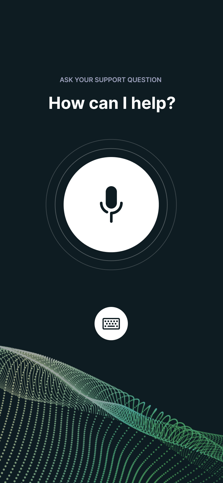
New utterance page

De-emphasise voice
Referring back to the user testing — most users understandably didn't want to use voice. Therefore, the emphasis on voice has been minimised, with the 'I'm listening' page now available by pressing the microphone button on the text input.
Context framing
Again, user testing showed that users needed prompting on what to say or type. Now, available commands are positioned throughout the app, as well as displaying 'Today's most common issues' to provide context and time-aware interactions.
Interactions in progress
Currently, once a user exits out of a self-help interaction they need to start over. There's no going back to where they left off. This could be a pain-point for larger interactions such as installing a router. I incorporated in a 'in progress' section so users could pick up where they left off.
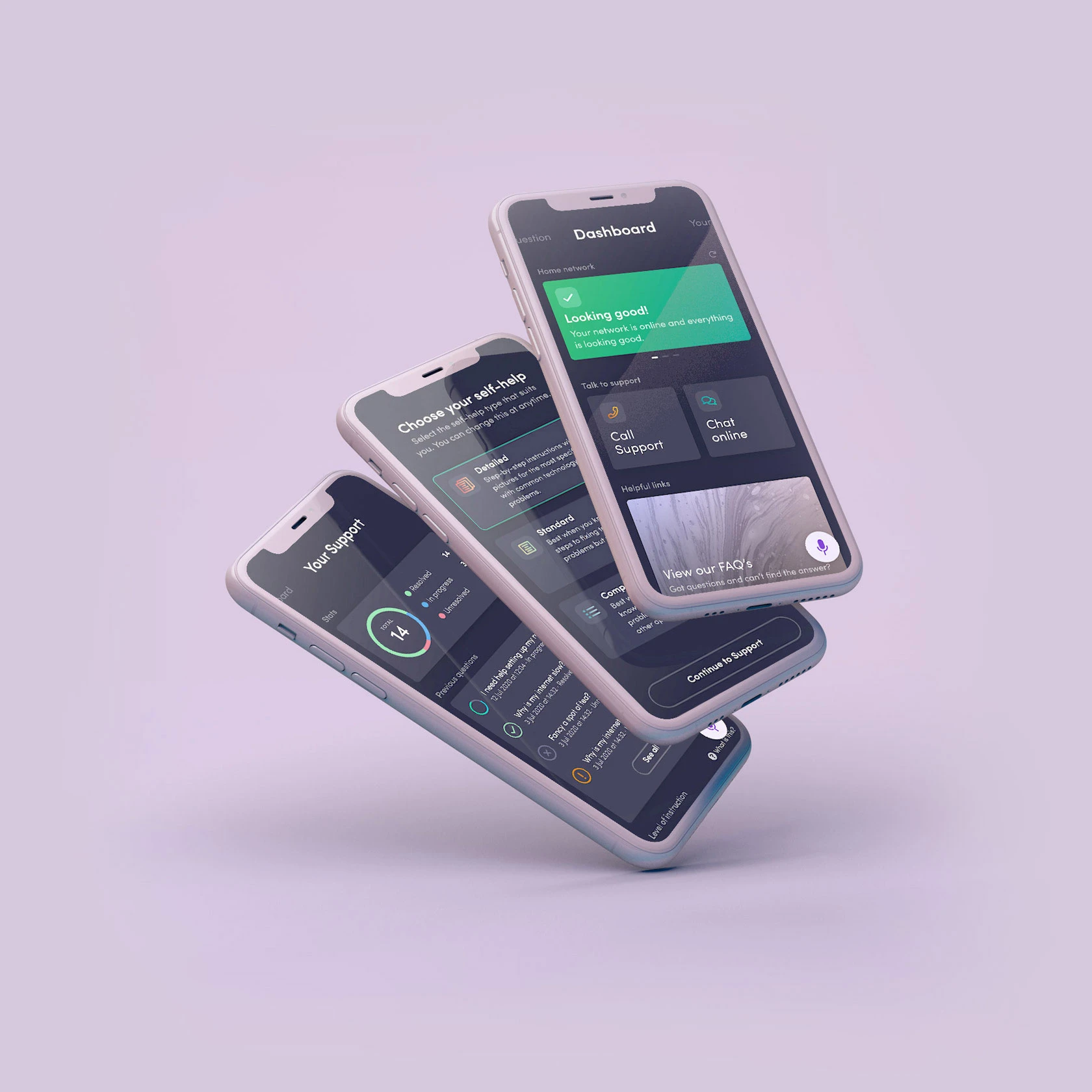
The Dashboard
More modularity
A new dashboard was designed to bring a more functional and modular approach to our service. Now, rather than trying to 'shoe-in' client-specific features, customisable cards could be reordered, reworked or removed as necessary.
More proactive
The 'feature-piece' of the new dashboard design is the Network Summary, which provides a quick summary on how the user's network is performing, as well as network performance stats.
The general idea is to move away from our current 'reactive' approach (waiting for user to have a problem) and more into a 'proactive' approach (routintely diagnosing before it becomes a problem).

Your Support
Giving power to the user
I wanted to reflect to the user that this isn't just normal support it's support that is personalised and catered towards them.

Interactive prototype
I created a medium-fidelity prototype in Figma to demonstrate some of the interactions and flow of the product.
