Case study
Crafting a 1Password Onboarding Framework
Intro
Redesigning the onboarding experience for 1Password's Admin Console.
The problem
Various quantitive and qualitative data has pointed out that the user onboarding for the 1Password Admin Console is insufficient. It doesn't do a good job of guiding the user down a path of getting setup. Instead, it mainly leaves it up to the user to figure things out.
The Team
First things first, when I refer to ‘we’ in this case study, I am collectively referring to these individuals (and many others), who each played a part in making this project come to life:
Max Applin
Team Lead

Sasha VanHoven
Content Lead

Chris Burgin
Tech Lead

Samaher Ramzan
Research Lead

Whymarrh Whitby
Sr Developer

Research
User Journey
In order to get an understanding of the pain points a user faces when signing up to 1Password I created this user journey.
It proved useful in diagnosing issues where a user may face problems or frustrations within the admin console, such as:
- Displaying a payment modal on first use of the product
- Not explaining core concepts such as vaults
Onboarding Training Sessions
At 1Password we actually have a dedicated customer onboarding team that will walk user’s through the product on a zoom call and answer any questions they may have. These are a great experience for the user but naturally, not very scalable, as each call is around an hour each.
I sat in on a few of these calls to understand how our team walked user’s through the product and to see how user’s interpreted the product.
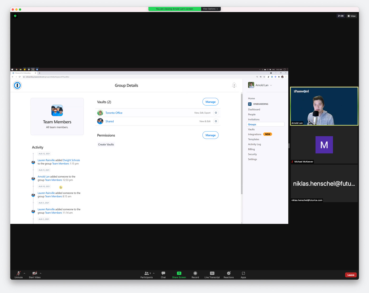
Some key takeaways from the calls:
- User’s generally understand the concept of vaults
- User’s usually create groups of people and add those groups to vaults
- Business/Teams User’s are generally unsure about Family Accounts and how to set them up
Heuristic Evaluation
In order to get an understanding of the types of tasks a user might struggle with when first using the admin console, I reviewed an existing heuristic evaluation undertaken by our research team.
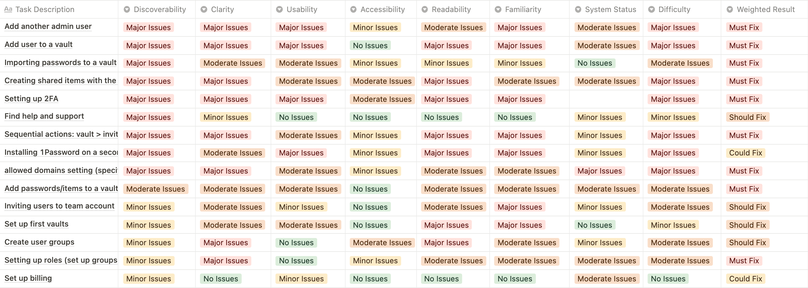
Tasks that some users where struggling with included:
- Creating a vault
- Importing passwords to a vault
- Installing 1Password on secondary devices
- Adding items to a vault
- Inviting users
- Creating groups
- Setting up Billing
Better Onboarding
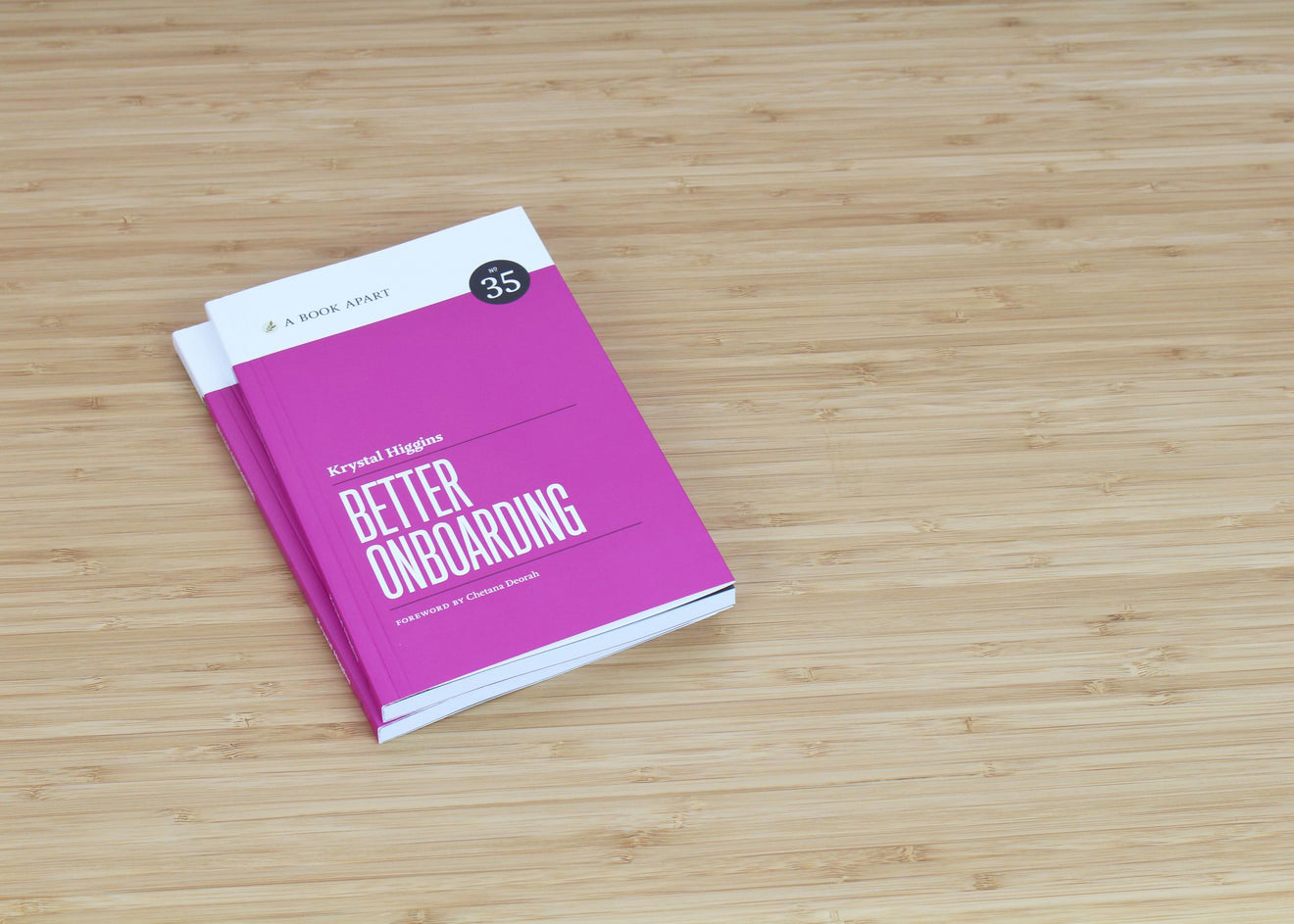
Krystal Higgin’s book Better Onboarding was essential reading when it came to understanding onboarding concepts and the best practices in integrating them. One of the key takeaways for me was visualising onboarding as an ever-changing, ever-evolving feature of the product that adapts and grows. Rather than a one-off “design it and ship it!” feature that stays static until it’s next redesign.
Useronboard.com
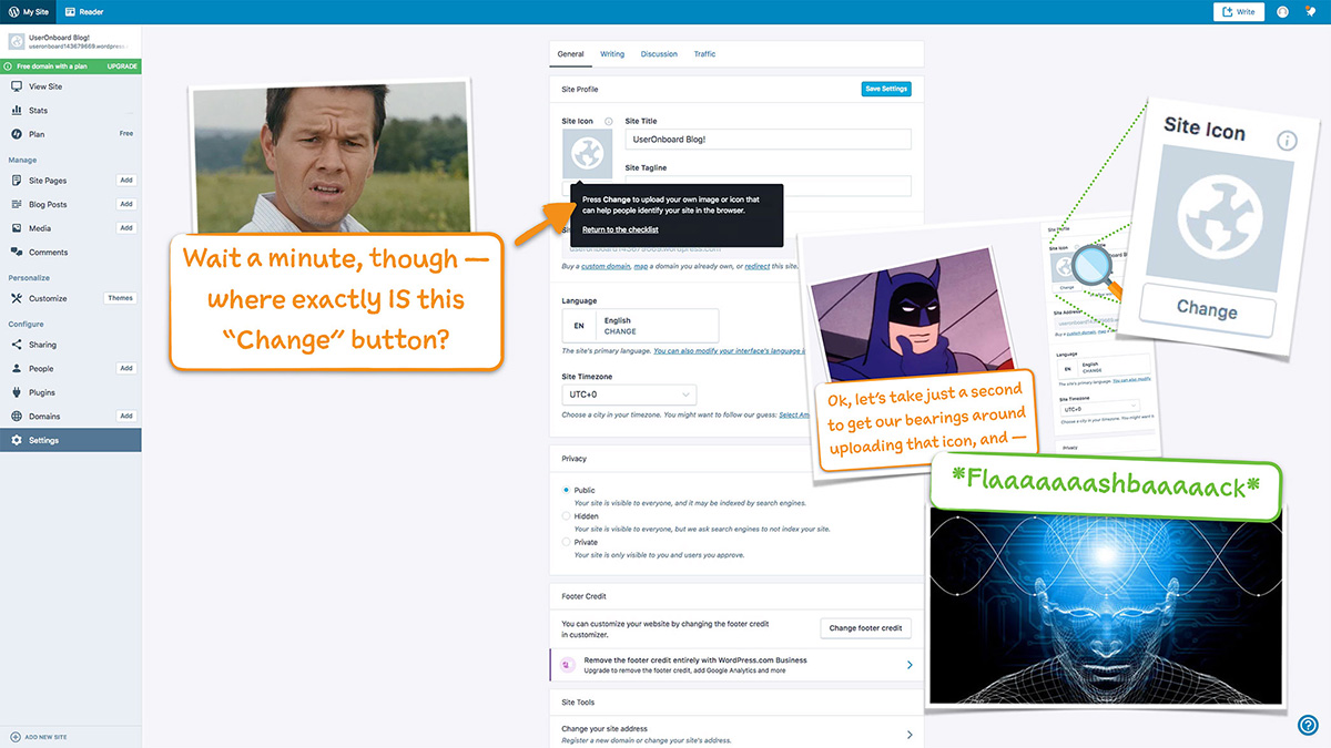
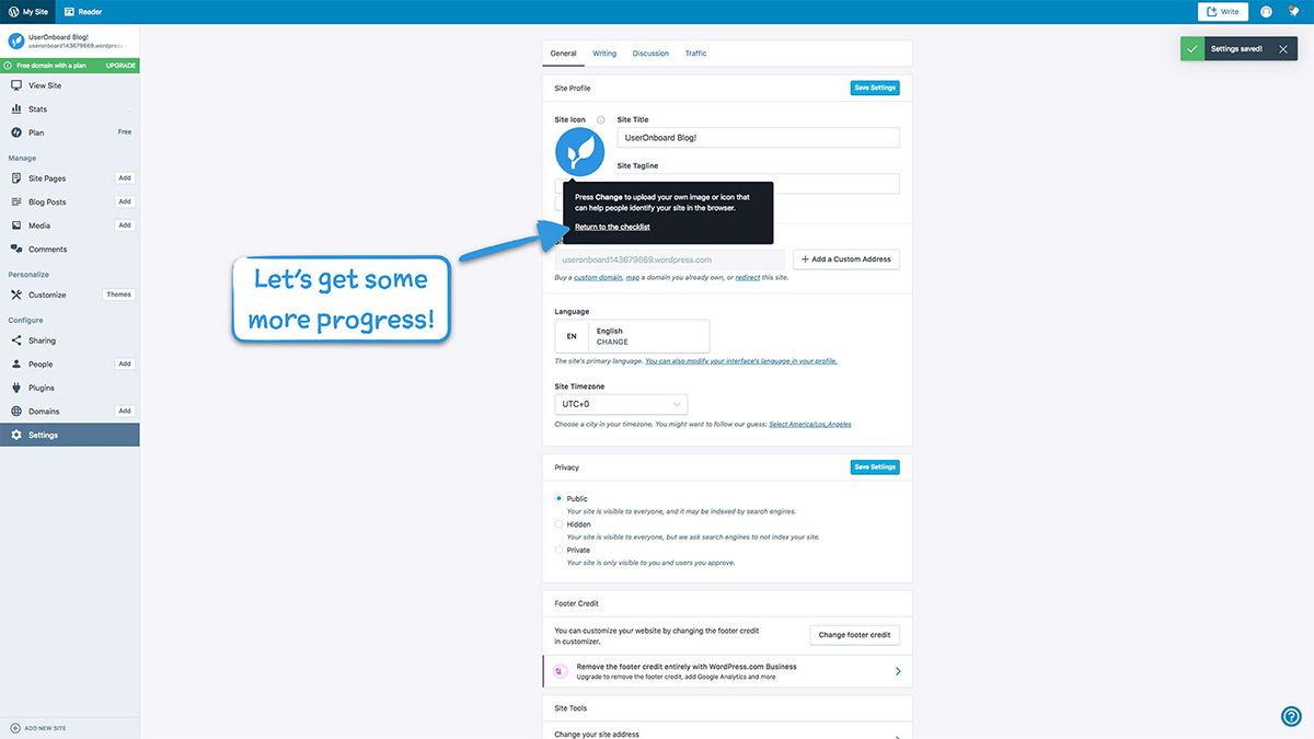
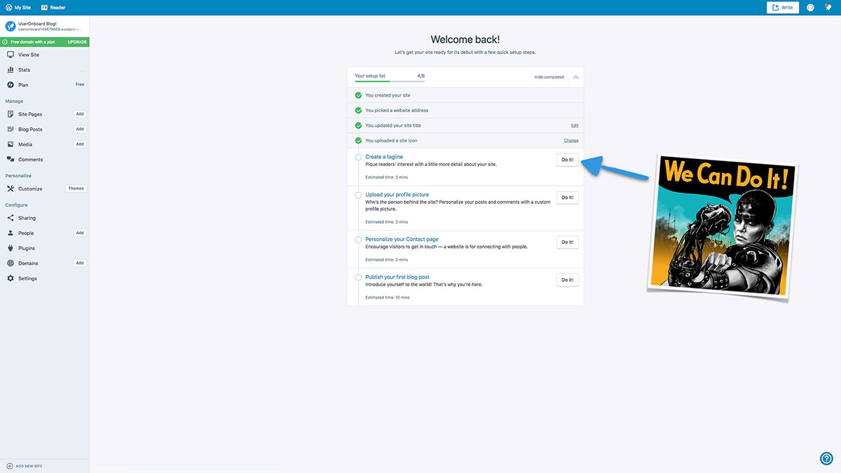
Another fantastic resource was useronboard.com. It does "teardowns" of product’s onboarding flows with annotations and fun commentary showcasing what works and what doesn’t quite work. It makes for great qualitative research.
Wireframing exploration
Utilising the gathered research so far, I wireframed some concepts of how onboarding could be approached for the admin console.
Concept 1: Unopinionated
Onboarding tasks are displayed within a linear timeline view. Each task item would have a finished and unfinished state to visualise which onboarding tasks have been completed. Tasks could be completed in any order the user wishes but this view would heavily suggest completing tasks in a recommended order.
Option 1: Task timeline
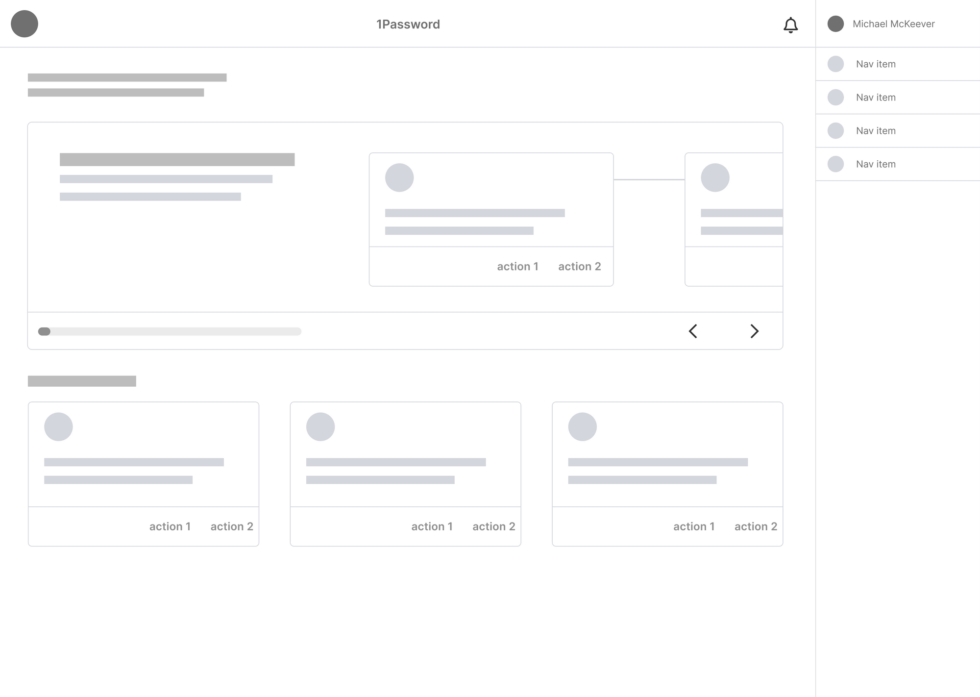
Tasks are displayed horizontally within a large card. Once a task is complete, the task is marked as done and the progress indicator updates. A user can manually interact with the timeline using the arrows or they can complete each task in a linear fashion.
Option 2: Popover
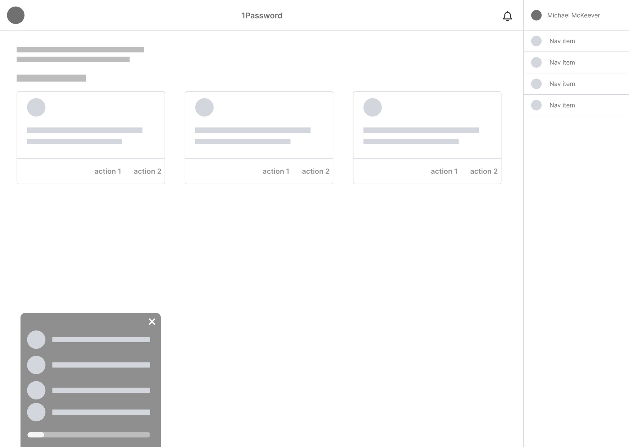
Tasks are displayed in a vertical timeline within a popover. This would mean that the timeline is separated from the home page itself and instead would “follow” the user around the web app until tasks are completed or it is dismissed.
Concept 2: Opinionated full-page timeline
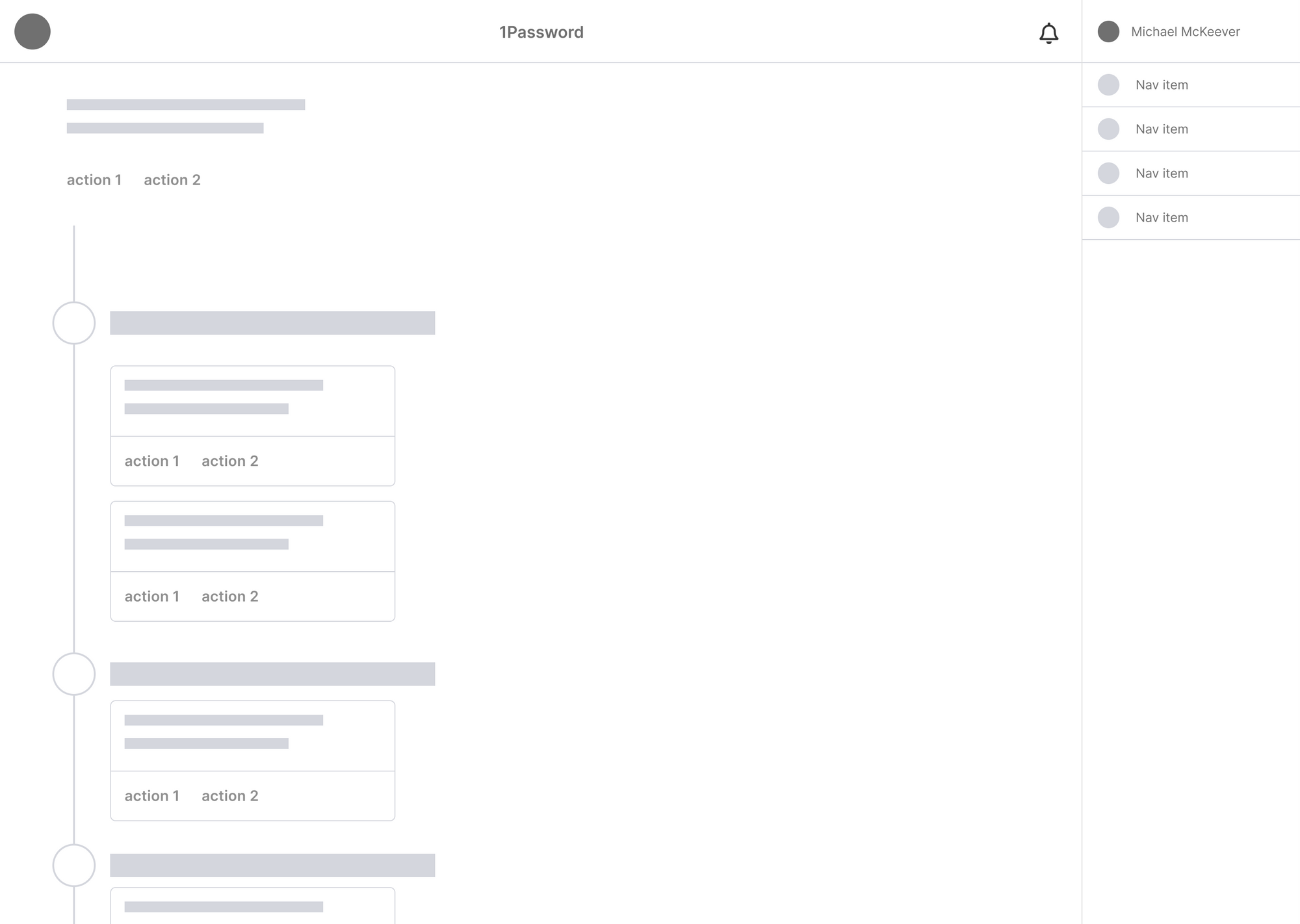
Onboarding tasks are displayed within a linear timeline view. Each task item would have a finished and unfinished state to visualise which onboarding tasks have been completed. Unlike the unopinionated view, tasks would need to be completed in the outlined order.
Concept 3: Choose your own path
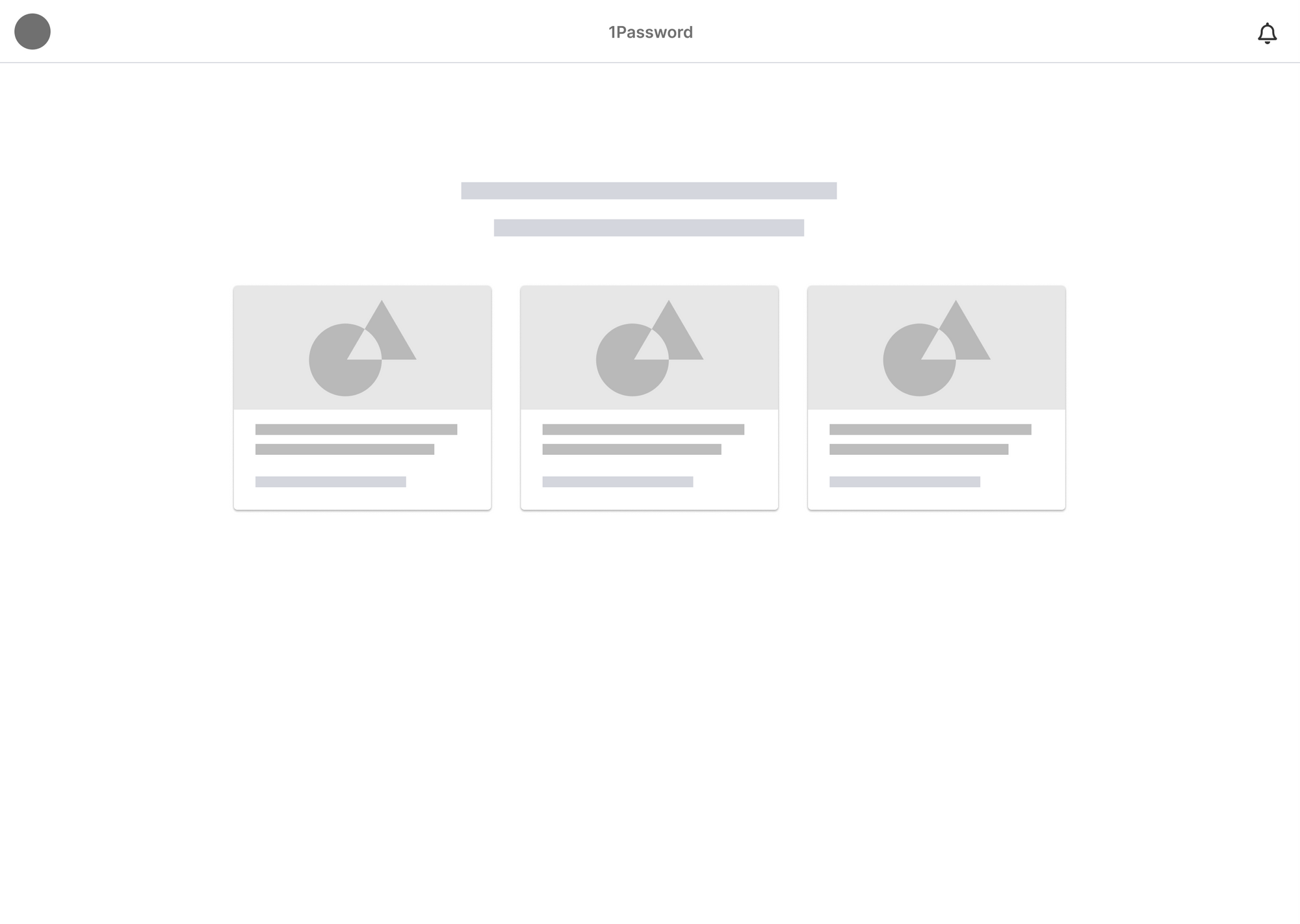
Choose your own path takes a less linear approach to onboarding and instead presents the user with a series of options to choose from.
When a user first logs onto the web app they are presented with this onboarding view page rather than the default home page. They will be presented with a series of options to choose from in order to start their onboarding journey. For example:
- Import your passwords
- Create a shared vault
- Invite your team
Deciding on a concept
Due to project constraints, it wasn’t possible to validate any of the concepts through user testing, so an executive decision was made to go with Concept 1 - Option 1 (Horizontal Task timeline).
Wireframe Prototype
Design
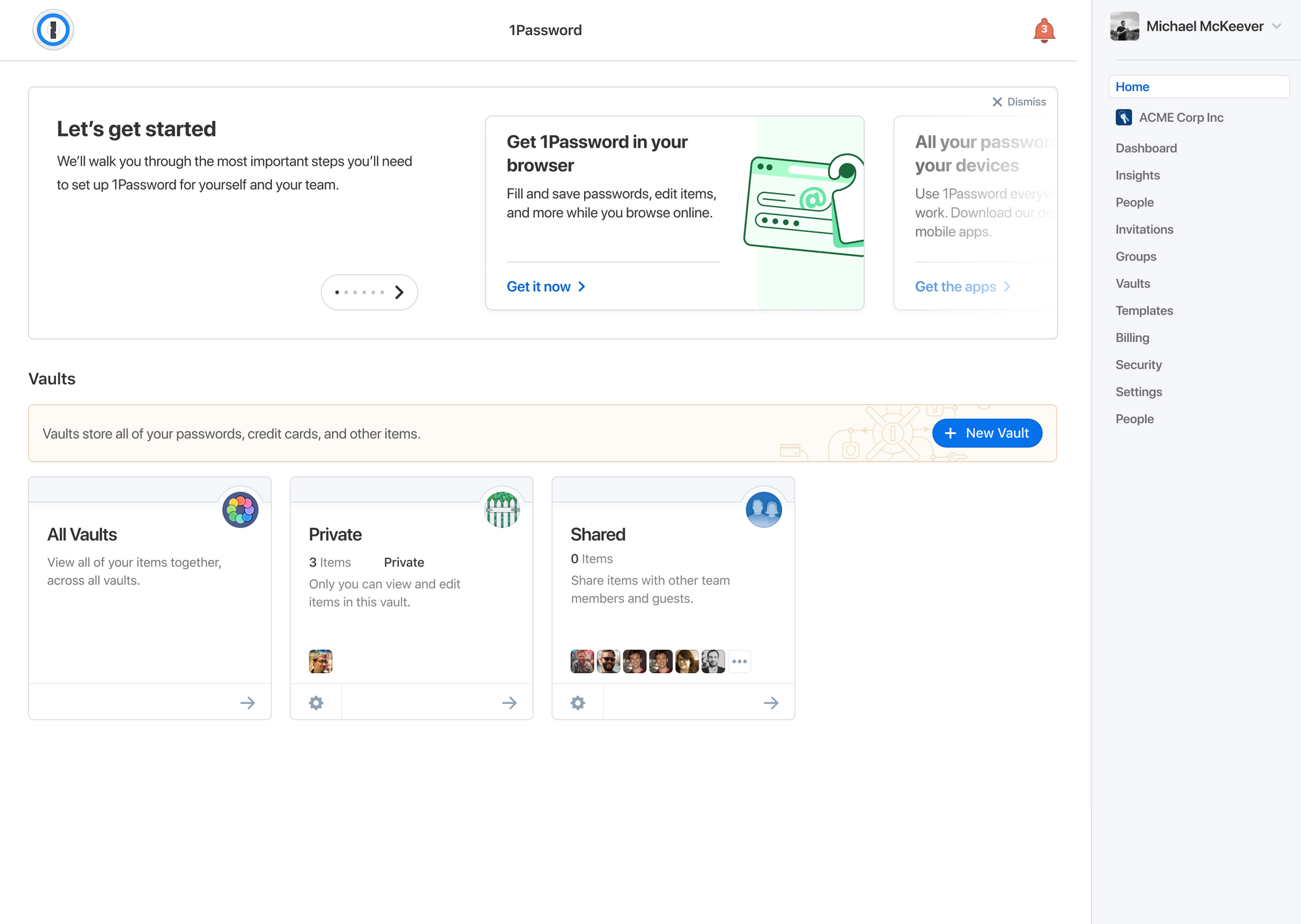
Creating the cards
Card sorting
We carried out a card sorting exercise to determine which onboarding cards to show to which type of user. For instance, team members can’t invite members or subscribe, so naturally it wouldn’t make sense to show them cards relating to those actions.
The number of people on the account had to be taken into consideration. A business size of 10 or less is going to have different goals than a business size of 500+. For instance, small team sizes will be more likely to manually invite team members, whereas larger companies will want to opt for provisioning services such as Okta.
Animating the cards
In order to increase delight and engagement, I animated each of the card's illustrations that plays when the card is in view.
Creating an interactive prototype
I used ProtoPie to create a interactive prototype to demonstrate the interactions and animations for the developers but also for running a usability test to determine which tasks a user carries out first and the effectiveness of the new onboarding approach.
You can interact with this prototype by clicking around. ✨
Usability testing
I used ProtoPie to create an interactive prototype to demonstrate the interactions and animations for the developers but also for running a usability test to determine which tasks a user carries out first and the effectiveness of the new onboarding approach.
The participants

Farah

Natalie

Jamy

Jennifer

Adam
The participants were all new 1Password users, with various degrees of experience with password managers. Using the prototype, they were tasked with creating a 1Password business or teams account and getting it setup.
Positive Insights
| Action | Who did it |
|---|---|
|
First clicked on onboarding cards |


|
|
Understood how to interact with the carousel |


|
|
Understood the concept of vaults |


|
|
Understood the concept of groups |


|
Neutral Insights
| Action | Who did it |
|---|---|
|
Mentioned wanting a video tutorial |


|
|
Preferred sending invites via email |


|
|
Preferred adding people to groups rather than vaults |


|
Negative Insights
| Action | Who did it |
|---|---|
|
Wanted more guidance on using vaults |


|
|
Ignored the 'Show More' button for vault suggestions |


|
|
Was unsure how to invite people to vaults |


|
|
Was unsure what to do after sending invites |


|
Research Findings
The usability testing showed that the onboarding process was successful and development could go ahead. Participants did struggle with the concept of vaults however, so education methods would need to be explored there for future projects.
Michael was integral to the success of our intiative. He couldn’t have done much more for the team and our mission. One of the best collaborators in the whole design team.


