Case study
Creating a design system for a suite of products
Intro
One of my first projects at Sweepr was helping to create a design system to align our suite of web apps.
The problem
When I first joined Sweepr, we had four web apps:
Interactions Editor
A CMS for creating self-support content
CSR Dashboard
Self-support monitoring for Customer Support
Alias Editor
Create recognisable aliases for interactions
Operations Dashboard
A monitoring service for interactions
The problems here were the classic case of designing multiple products without a centralised design system:
- Inconsistent styling, design language & patterns across the different products
- More time spent on designing new components, patterns and less on the actual problem
Design audit
We carried out a design audit on all of the existing products to get a sense of the polarity and inconsistencies between each of them.

It also provided us with data on which components are used most frequently, allowing us to determine the elements that should be focused on first.
Finding a font family
One of the most important aspects of any digital product is the typography.
We researched and trialled a number of super families to determine one that could be used across our products.
Eventually, we settled on using Inter for its versatility, readability at smaller font sizes, and its numerous OpenType features.

Building a colour palette
Before creating our palette, we first had to determine the colours that we wanted to support, such as:
- Primary or accent colours
- Grays
- State colours (such as success, info, error & warning)
- Secondary colours

Once we had done this, we then needed to create the different accent from each of the base colours. Therefore, each base colour would have 9 accents (e.g. green-100 to green-1000) to provide us with plenty of versatility for each base colour.
To make it easier to apply to WCAG colour accessibility guidelines, each colour and it's accents were marked with it's compliance score (e.g. is this colour AAA or AA compliant?)
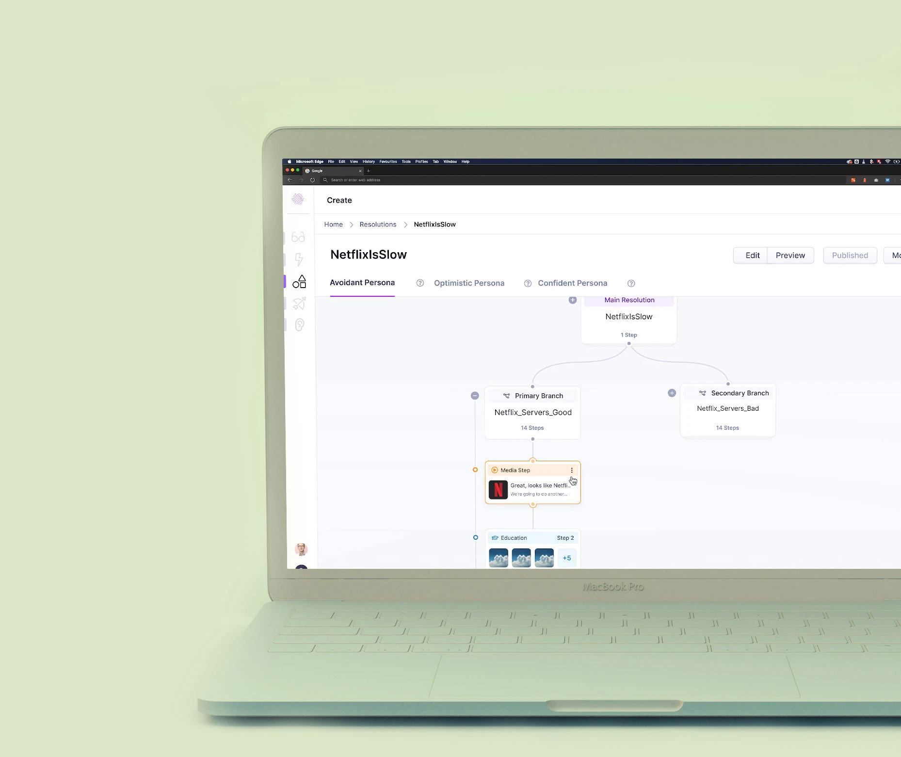
Creating components
Our design audit had provided us with a list of components currently being used that we would need to redesign, but I also carried out a lot of research on other design systems to collate data on other components that we may need in our products.


There was also an organic nature to this, where components would be created for the design system when and where they're needed.
Adding documentation for developers
Having your one source of truth in Figma is great for the designers but not very accessible to developers for numerous reasons.
To combat this we created internal documentation to showcase the design system components in a more accessible method, as well as explain best practices, show code examples and link to resources.


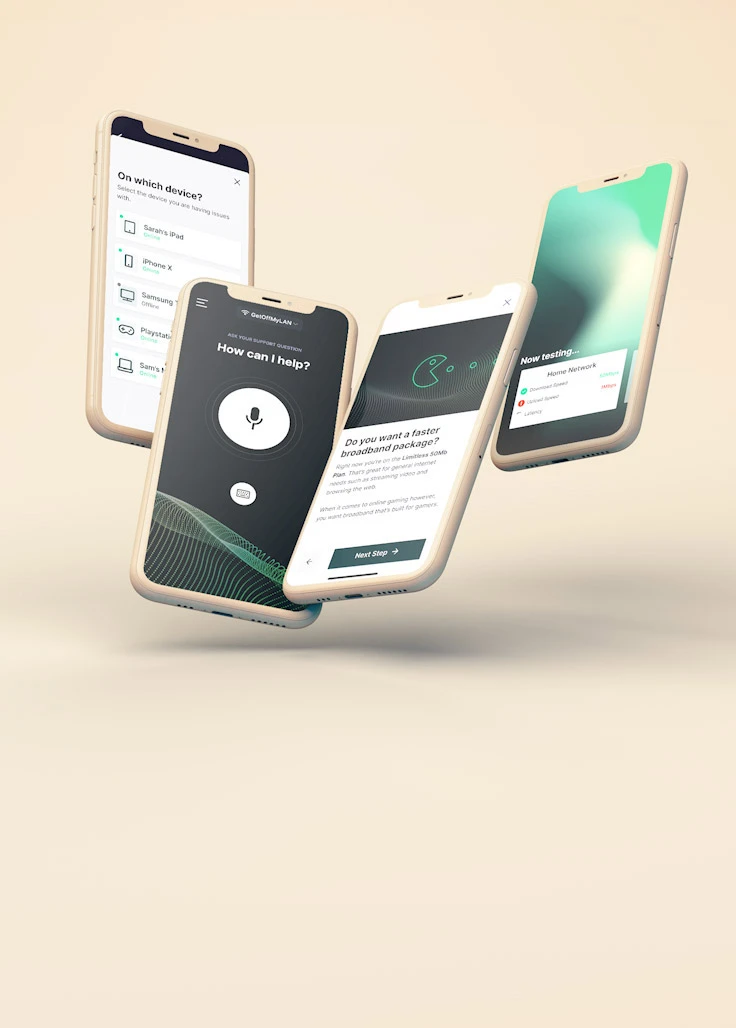
Using the design system in the wild
The first product I started to work on after we had created the design system was the Interaction Editor.

Designing this product was a large & complex piece of work that spanned over 6 months. Thankfully, with the design system in place, much of the low complexity ∞ high effort tasks, such as component design, didn't require as much focus.


This meant more time could be shifted towards higher complexity tasks such as UX thinking, structure and design.
In conclusion
Creating our design system had a large impact on the overall company. It allowed us to create new products and features more efficiently and effectively.
It also provided our engineering team with a one source of truth for all components & styles, allowing them to code more efficiently and produce more consistent, accessible components.